Week 6: Presentations

Author

Robert W. Walker

Published

February 20, 2023

Meeting Date: February 20, 2023.

Last updated: 2023-04-10 13:53:21

Timezone: America/Los_Angeles

Class Plan

  1. AMA
  2. A Review of Interactive Graphics in R
    • Crosstalk related tools
    • Some Crosstalk specials
    • ggiraph
  3. Presentations with Quarto Markdown

Slides:

Week 6 Slides

Homework

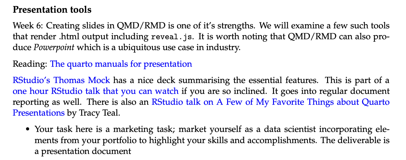
The sixth assignment consists of a presentation selling yourself.

Syllabus Module for Week 6

Deliverables: an email containing the URL to the presentation.

The Site I am Building

My github main page

Readings:

  • Quarto Documentation [if not already done]

Resources

Interactive Graphics

Quarto Reference on Presentations

Parameterized Markdown [for next time]

Syllabus cutout

Stocks and Plotly

The plotly package

plotly as a package has far more it can do.

Code
library(plotly); library(magrittr)
library(tidyquant)
# Use tidyquant to get the data
INTC <- tq_get("INTC")
# Slice off the most recent 90 days
INTC.tail.90 <- tail(INTC, 90)
INTC.tail <- INTC.tail.90
# Create a counter of days
INTC.tail$ID <- seq.int(nrow(INTC.tail))
# Round the prices to 2 digits
INTC.tail %<>% mutate(close = round(close, digits=2))

Now we want a function to create the dataset for each stage of the animation. There are a few ways to do this but most involve writing a function to create them. This example function comes from the plotly documents.

Code
# This is in the example for plotly paths
# First a supporting function: getLevels takes input x
getLevels <- function (x) {
  # if x is a factor
    if (is.factor(x)) 
  # grab the levels of x
        levels(x)
  # if x is not a factor, sort unique values of x
    else sort(unique(x))
}
# Two inputs, the data and the variable to form the splits along the x-axis
accumulate_by <- function(dat, var) {
  # This handles linking variables to their environment
  var <- lazyeval::f_eval(var, dat)
  # get the levels of the given variable using the function above
  lvls <- getLevels(var)
  # use lapply, tidy would use map to iterate over the levels in `lvls` and column bind the data with frame denotes by lvls[[x]]
  dats <- lapply(seq_along(lvls), function(x) {
   cbind(dat[var %in% lvls[seq(1, x)], ], frame = lvls[[x]])
  })
  # bind the rows together
  dplyr::bind_rows(dats)
}
# Invoke the function on our ID variable
INTC.tail <- INTC.tail %>% accumulate_by(~ID)
# Create a figure of ID and close for each frame value using plotly's version of a line plot: type:scatter-mode:lines
# The rest is standard plotly
fig <- INTC.tail %>% plot_ly(
  x = ~ID, 
  y = ~close, 
  frame = ~frame,
  type = 'scatter', 
  mode = 'lines', 
  # This is short for fill to zero on the y-axis
  fill = 'tozeroy',
  fillcolor='rgba(73, 26, 201, 0.5)',
  line = list(color = 'rgb(73, 26, 201)'),
  text = ~paste("Date: ", date, "<br>Close: $", close), 
  hoverinfo = 'text'
)
# Add the layout; one title and two axes
# I also mess with the margin to keep the figure from being cut off.
fig <- fig %>% layout(
  title ="Intel Stock Closing Price: Last 90 Days",
  yaxis = list(
    title = "Close", 
    range = c(0,50), 
    zeroline = F,
    tickprefix = "$"
  ),
  xaxis = list(
    title = "Day", 
    range = c(0,90), 
    zeroline = F, 
    showgrid = F
  ),
  margin = list(t=120) # adjust the plot margin to avoid cutting off letters
) 
# Animate the figure with 100 frames
fig <- fig %>% animation_opts(
  frame = 100, # transition time 100 ms
  transition = 0, # duration of smooth transition in ms
  redraw = FALSE # redraw the plot at each transition?
)
fig <- fig %>% animation_slider(
  currentvalue = list(
    prefix = "Day "
  )
)
fig
0102030405060708090$0$10$20$30$40$50
Day 11357911131517192123252729313335373941434547495153555759616365676971737577798183858789Intel Stock Closing Price: Last 90 DaysDayClosePlay

An easier plotly for these data because they are OHLC

A link to a stand-alone document with all the data.

Code
# basic example of ohlc charts
# custom colors
i <- list(line = list(color = '#000000')) # black
d <- list(line = list(color = '#FF0000')) # red
# Create the figure
fig.2 <- INTC.tail.90 %>%
  plot_ly(x = ~date, type="ohlc",
          open = ~open, close = ~close,
          high = ~high, low = ~low,
          increasing = i, decreasing = d)
fig.2
Dec 42022Dec 18Jan 12023Jan 15Jan 29Feb 12Feb 26Mar 12Mar 262628303234
date

some tidyTuesday

The first two examples come from tidyTuesday on the Economist’s Visualization Errors. It is really great. My complete set of plots appears here.

Corbyn was a Facebook Engagement Machine

The data are a small table.

Code
library(ggrepel)
library(tidyverse) # call the tidyverse for %>% and ggplot
library(ggthemes) # Use the economist theme
library(ggiraph)
library(DT)
corbyn <- readr::read_csv("https://raw.githubusercontent.com/rfordatascience/tidytuesday/master/data/2019/2019-04-16/corbyn.csv")
datatable(corbyn)

ggiraph of barplot and lollipop chart

I want to plot this in a barplot that is linked with a lollipop chart.

Code
p1.Int <- ggplot(corbyn, aes(x=reorder(political_group,avg_facebook_likes), data_id=political_group, y=avg_facebook_likes, label=avg_facebook_likes, tooltip = paste0(political_group,"<br>",avg_facebook_likes, sep=""))) + 
  geom_bar_interactive(stat="identity", fill="#DC241f") + 
  geom_label(fill="#DC241f", color="#FFFFFF", size=3.5) +
  labs(x="Associate of the Labour Party", y="Average Facebook Likes") +
  hrbrthemes::theme_ipsum_rc() +
  coord_flip()
p2.Int <- ggplot(corbyn, aes(x=reorder(political_group,avg_facebook_likes), y=avg_facebook_likes, label=avg_facebook_likes, data_id=political_group, tooltip = paste0(political_group,"<br>",avg_facebook_likes, sep=""))) + 
  geom_segment_interactive(aes(yend=0, xend=political_group), size=2, color="#DC241f") + 
  geom_point(size=10, color="#DC241f", alpha=0.8) +
  geom_text(color="#FFFFFF", size=3.5, fontface=2) +
  labs(x="Associate of the Labour Party", y="Average Facebook Likes") +
  hrbrthemes::theme_ipsum_rc() +
  coord_flip()
library(patchwork)
GIp1 <- p1.Int / p2.Int
girafe(ggobj=GIp1)
5210 845 229 127 105 56 Saving Labour Andy Burnham Owen Smith Momentum Labour Party Jeremy Corbyn 0 1000 2000 3000 4000 5000 Average Facebook Likes Associate of the Labour Party 5210 845 229 127 105 56 Saving Labour Andy Burnham Owen Smith Momentum Labour Party Jeremy Corbyn 0 1000 2000 3000 4000 5000 Average Facebook Likes Associate of the Labour Party

Women in Science

I had a simple example for last week. Now I want to make it nicer. The data are essentially a table. Let me show it using pivot_wider.

Code
women_research <- readr::read_csv("https://raw.githubusercontent.com/rfordatascience/tidytuesday/master/data/2019/2019-04-16/women_research.csv")
women_research
ABCDEFGHIJ0123456789
country
<chr>
field
<chr>
percent_women
<dbl>
JapanHealth sciences0.24
ChileHealth sciences0.43
United KingdomHealth sciences0.45
United StatesHealth sciences0.46
MexicoHealth sciences0.46
DenmarkHealth sciences0.47
EU28Health sciences0.48
FranceHealth sciences0.48
CanadaHealth sciences0.49
AustraliaHealth sciences0.50
Code
# There's a spelling error I want to fix, select the rows and columns to fix and reassign the value
women_research[women_research$field=="Women inventores","field"] <- "Women Inventors" 
# The label for CS/Maths is too long, also
women_research[women_research$field=="Computer science, maths","field"] <- "CS/Math" 
# Make it wider
WIR.Wide <- women_research %>% pivot_wider(., id_cols=country, names_from=field, values_from=percent_women)
# A datatable
datatable(WIR.Wide)
Code
WIR.TTip <- WIR.Wide %>% mutate(text.for.tooltip = paste0(country, "<br> Health sciences: ", `Health sciences`, "<br> Physical sciences: ",`Physical sciences`, "<br> Engineering: ",Engineering,"<br> CS/Math: ", `CS/Math`, "<br> Women Inventors: ",`Women Inventors`, sep="")) %>% select(country, text.for.tooltip)
women_research <- women_research %>% left_join(., WIR.TTip)

An Interactive plot of Women in Research

Code
library(ggiraph)
women_research <- women_research %>% group_by(country) %>% mutate(Avg.Women.Percent = mean(percent_women)) %>% ungroup()
women_research$PercentWomen <- as.character(round(women_research$percent_women, 3))
p1 <- ggplot(women_research) +
 aes(x = reorder(country,Avg.Women.Percent), fill = country, weight = percent_women, tooltip = text.for.tooltip, data_id = country) +
 geom_bar_interactive() +
 scale_fill_viridis_d(option = "cividis") +
 guides(fill=FALSE) +
 coord_flip() +
 theme_minimal() + 
  theme(axis.text.y = element_text(angle = 45, hjust = 1, size=3)) +
  labs(y = "Percent of Publications/Patents", x = "Country/Group", fill="Country/Grouping", title = "Publication and Invention by Women Around the World", subtitle = "Percent of Publications or Patents by Women", caption = "source: Economist Visualization Errors") +
 facet_wrap(~field)
library(patchwork)
ggp1.changed <- ggplot(women_research) +
 aes(x = field, y = reorder(country,Avg.Women.Percent), fill = percent_women, , data_id = country, tooltip=text.for.tooltip) +
 geom_tile_interactive(size = 1L) +
 scale_fill_viridis_c(option="cividis") +
 labs(x = "Field or Occupation", y = "Country", fill = "% Women") +
 theme_minimal(base_size = 10)
ggp1.changed <- ggp1.changed + theme(plot.background = element_rect(colour = "whitesmoke"))
comb1 <- p1 / ggp1.changed
girafe(code = print(comb1))
Physical sciences Women Inventors 0.0 0.2 0.4 CS/Math Engineering Health sciences 0.0 0.2 0.4 0.0 0.2 0.4 Japan United Kingdom Chile Denmark United States Canada EU28 Australia France Mexico Brazil Portugal Japan United Kingdom Chile Denmark United States Canada EU28 Australia France Mexico Brazil Portugal Percent of Publications/Patents Country/Group Percent of Publications or Patents by Women Publication and Invention by Women Around the World source: Economist Visualization Errors Japan United Kingdom Chile Denmark United States Canada EU28 Australia France Mexico Brazil Portugal CS/Math Engineering Health sciences Physical sciences Women Inventors Field or Occupation Country 0.1 0.2 0.3 0.4 0.5 % Women

A Brief Crosstalk

Getting this to work wasn’t hard. Getting it to style properly in interaction with the bootstrap frame was a pain. I finally just went with a blank column in two places to make sure that names don’t get cut off.

Code
library(htmltools)
library(crosstalk)
library(DT)
library(d3scatter)
# Load the data
Bonds <- read.csv(url("https://github.com/robertwwalker/DADMStuff/raw/master/BondFunds.csv"), row.names=1)
# Turn characters into factors
Bonds <- Bonds %>% mutate(Fees = as.factor(Fees), Risk = as.factor(Risk), Type = as.factor(Type))
# Create shared data object
shared_bonds <- SharedData$new(Bonds)
# Generate the bootsrap columns as three rows, page is 12 wide
bscols(widths=c(12,12,12),
  # A d3 visualization
  d3scatter(shared_bonds, ~Expense.Ratio, ~Return.2009, ~Risk),
  # The filter checkboxes
  list(filter_checkbox("Fees", "Fees", shared_bonds, ~Fees, inline=TRUE),
       filter_checkbox("Type", "Type", shared_bonds, ~Type, inline=TRUE),
       filter_checkbox("Fees", "Risk", shared_bonds, ~Risk, inline=TRUE)),
  # The datatable
  datatable(shared_bonds))
Expense.Ratio0.00.20.40.60.81.01.21.41.61.82.0Return.2009-10-505101520253035Above averageAverageBelow average

Without the bootstrap formatting of the webpage, it works much better.

image

The Fix for the cutoff parts

The trick to getting this to display properly was a blank column with width=1.

Code
shared_bonds2 <- SharedData$new(Bonds)
# This was adjusted from above
bscols(widths=c(12,1,11,1,11),
  d3scatter(shared_bonds2, ~Expense.Ratio, ~Return.2009, ~Risk),
  "",  # First blank column
  list(filter_checkbox("Fees", "Fees", shared_bonds2, ~Fees, inline=TRUE),
       filter_checkbox("Type", "Type", shared_bonds2, ~Type, inline=TRUE),
       filter_checkbox("Fees", "Risk", shared_bonds2, ~Risk, inline=TRUE)),
  "", # Second blank column
  datatable(shared_bonds2))
Expense.Ratio0.00.20.40.60.81.01.21.41.61.82.0Return.2009-10-505101520253035Above averageAverageBelow average

On Presentations

  • I have used reveal.js since the beginning of the term. There is a slides repository on my github showing how I have done pretty much all of this.

  • The pptx functionality is pretty limited as is PowerPoint. But it serves many useful purposes for Microsoft shops and that is very common.

  • If you want to know about beamer just ask. I use $\LaTeX$ for lots of things but that is a whole new [and arguably pretty useless] set of skills unless you need to give highly technical presentations with odd math formatting.

References

Code
knitr::write_bib(names(sessionInfo()$otherPkgs), file="bibliography.bib")

References

Arnold, Jeffrey B. 2021. Ggthemes: Extra Themes, Scales and Geoms for Ggplot2. https://github.com/jrnold/ggthemes.
Bache, Stefan Milton, and Hadley Wickham. 2022. Magrittr: A Forward-Pipe Operator for r. https://CRAN.R-project.org/package=magrittr.
Cheng, Joe. 2023. D3scatter: Demo of D3 Scatter Plot; Testbed for Crosstalk Library.
Cheng, Joe, and Carson Sievert. 2021. Crosstalk: Inter-Widget Interactivity for HTML Widgets. https://rstudio.github.io/crosstalk/.
Cheng, Joe, Carson Sievert, Barret Schloerke, Winston Chang, Yihui Xie, and Jeff Allen. 2023. Htmltools: Tools for HTML. https://CRAN.R-project.org/package=htmltools.
Dancho, Matt, and Davis Vaughan. 2023. Tidyquant: Tidy Quantitative Financial Analysis. https://github.com/business-science/tidyquant.
Gohel, David, and Panagiotis Skintzos. 2023. Ggiraph: Make Ggplot2 Graphics Interactive. https://davidgohel.github.io/ggiraph/.
Grolemund, Garrett, and Hadley Wickham. 2011. “Dates and Times Made Easy with lubridate.” Journal of Statistical Software 40 (3): 1–25. https://www.jstatsoft.org/v40/i03/.
Müller, Kirill, and Hadley Wickham. 2023. Tibble: Simple Data Frames. https://CRAN.R-project.org/package=tibble.
Pedersen, Thomas Lin. 2022. Patchwork: The Composer of Plots. https://CRAN.R-project.org/package=patchwork.
Peterson, Brian G., and Peter Carl. 2020. PerformanceAnalytics: Econometric Tools for Performance and Risk Analysis. https://github.com/braverock/PerformanceAnalytics.
Ryan, Jeffrey A., and Joshua M. Ulrich. 2022. Quantmod: Quantitative Financial Modelling Framework. https://CRAN.R-project.org/package=quantmod.
———. 2023. Xts: eXtensible Time Series. https://github.com/joshuaulrich/xts.
Sievert, Carson. 2020. Interactive Web-Based Data Visualization with r, Plotly, and Shiny. Chapman; Hall/CRC. https://plotly-r.com.
Sievert, Carson, Chris Parmer, Toby Hocking, Scott Chamberlain, Karthik Ram, Marianne Corvellec, and Pedro Despouy. 2022. Plotly: Create Interactive Web Graphics via Plotly.js. https://CRAN.R-project.org/package=plotly.
Slowikowski, Kamil. 2023. Ggrepel: Automatically Position Non-Overlapping Text Labels with Ggplot2. https://github.com/slowkow/ggrepel.
Spinu, Vitalie, Garrett Grolemund, and Hadley Wickham. 2023. Lubridate: Make Dealing with Dates a Little Easier. https://CRAN.R-project.org/package=lubridate.
Ulrich, Joshua. 2021. TTR: Technical Trading Rules. https://github.com/joshuaulrich/TTR.
Wickham, Hadley. 2016. Ggplot2: Elegant Graphics for Data Analysis. Springer-Verlag New York. https://ggplot2.tidyverse.org.
———. 2022. Stringr: Simple, Consistent Wrappers for Common String Operations. https://CRAN.R-project.org/package=stringr.
———. 2023a. Forcats: Tools for Working with Categorical Variables (Factors). https://CRAN.R-project.org/package=forcats.
———. 2023b. Tidyverse: Easily Install and Load the Tidyverse. https://CRAN.R-project.org/package=tidyverse.
Wickham, Hadley, Mara Averick, Jennifer Bryan, Winston Chang, Lucy D’Agostino McGowan, Romain François, Garrett Grolemund, et al. 2019. “Welcome to the tidyverse.” Journal of Open Source Software 4 (43): 1686. https://doi.org/10.21105/joss.01686.
Wickham, Hadley, Winston Chang, Lionel Henry, Thomas Lin Pedersen, Kohske Takahashi, Claus Wilke, Kara Woo, Hiroaki Yutani, and Dewey Dunnington. 2023. Ggplot2: Create Elegant Data Visualisations Using the Grammar of Graphics. https://CRAN.R-project.org/package=ggplot2.
Wickham, Hadley, Romain François, Lionel Henry, Kirill Müller, and Davis Vaughan. 2023. Dplyr: A Grammar of Data Manipulation. https://CRAN.R-project.org/package=dplyr.
Wickham, Hadley, and Lionel Henry. 2023. Purrr: Functional Programming Tools. https://CRAN.R-project.org/package=purrr.
Wickham, Hadley, Jim Hester, and Jennifer Bryan. 2023. Readr: Read Rectangular Text Data. https://CRAN.R-project.org/package=readr.
Wickham, Hadley, Davis Vaughan, and Maximilian Girlich. 2023. Tidyr: Tidy Messy Data. https://CRAN.R-project.org/package=tidyr.
Xie, Yihui, Joe Cheng, and Xianying Tan. 2023. DT: A Wrapper of the JavaScript Library DataTables. https://github.com/rstudio/DT.
Zeileis, Achim, and Gabor Grothendieck. 2005. “Zoo: S3 Infrastructure for Regular and Irregular Time Series.” Journal of Statistical Software 14 (6): 1–27. https://doi.org/10.18637/jss.v014.i06.
Zeileis, Achim, Gabor Grothendieck, and Jeffrey A. Ryan. 2022. Zoo: S3 Infrastructure for Regular and Irregular Time Series (z’s Ordered Observations). https://zoo.R-Forge.R-project.org/.