The aforementioned plots are methods for visualising the flow of data through a stream of markers. I was motivated to show this because enough of you deal in orders, tickets, and the like the flow visualisation of a system might prove of use. I will work with a familiar dataset. These are data on Admissions at the University of California Berkeley. The data exist as an internal R file in tabular form.
library(tidyverse)library(ggalluvial) # if this is not installed, install.packages("ggalluvial")data("UCBAdmissions") # This dataset is built in as a set of tables.UCBAdmissions # What does it look like?
, , Dept = A

          Gender
Admit      Male Female
  Admitted  512     89
  Rejected  313     19

, , Dept = B

          Gender
Admit      Male Female
  Admitted  353     17
  Rejected  207      8

, , Dept = C

          Gender
Admit      Male Female
  Admitted  120    202
  Rejected  205    391

, , Dept = D

          Gender
Admit      Male Female
  Admitted  138    131
  Rejected  279    244

, , Dept = E

          Gender
Admit      Male Female
  Admitted   53     94
  Rejected  138    299

, , Dept = F

          Gender
Admit      Male Female
  Admitted   22     24
  Rejected  351    317
UCBADF <-data.frame(UCBAdmissions) # Force it into a data.frameUCBADF # This is what the data structure needs to look like.
      Admit Gender Dept Freq
1  Admitted   Male    A  512
2  Rejected   Male    A  313
3  Admitted Female    A   89
4  Rejected Female    A   19
5  Admitted   Male    B  353
6  Rejected   Male    B  207
7  Admitted Female    B   17
8  Rejected Female    B    8
9  Admitted   Male    C  120
10 Rejected   Male    C  205
11 Admitted Female    C  202
12 Rejected Female    C  391
13 Admitted   Male    D  138
14 Rejected   Male    D  279
15 Admitted Female    D  131
16 Rejected Female    D  244
17 Admitted   Male    E   53
18 Rejected   Male    E  138
19 Admitted Female    E   94
20 Rejected Female    E  299
21 Admitted   Male    F   22
22 Rejected   Male    F  351
23 Admitted Female    F   24
24 Rejected Female    F  317
An Alluvial
This is the tidy version that we worked with at the individual level. To make this code work, change the below locations to import the same data.
   M.F Admit Dept
1 Male   Yes    A
2 Male   Yes    A
3 Male   Yes    A
4 Male   Yes    A
5 Male   Yes    A
6 Male   Yes    A
To put this data in a table, using the %>% pipe operator, we will pass the tidy data, group it by the elements of the alluvial, and then generate the counts.
# A tibble: 24 × 4
   M.F    Dept  Admit count
   <fct>  <fct> <fct> <int>
 1 Female A     No       19
 2 Female A     Yes      89
 3 Female B     No        8
 4 Female B     Yes      17
 5 Female C     No      391
 6 Female C     Yes     202
 7 Female D     No      244
 8 Female D     Yes     131
 9 Female E     No      299
10 Female E     Yes      94
# … with 14 more rows
ggalluvial()
The alluvial requires an additional package ggalluvial. We can install it through
install.packages("ggalluvial")
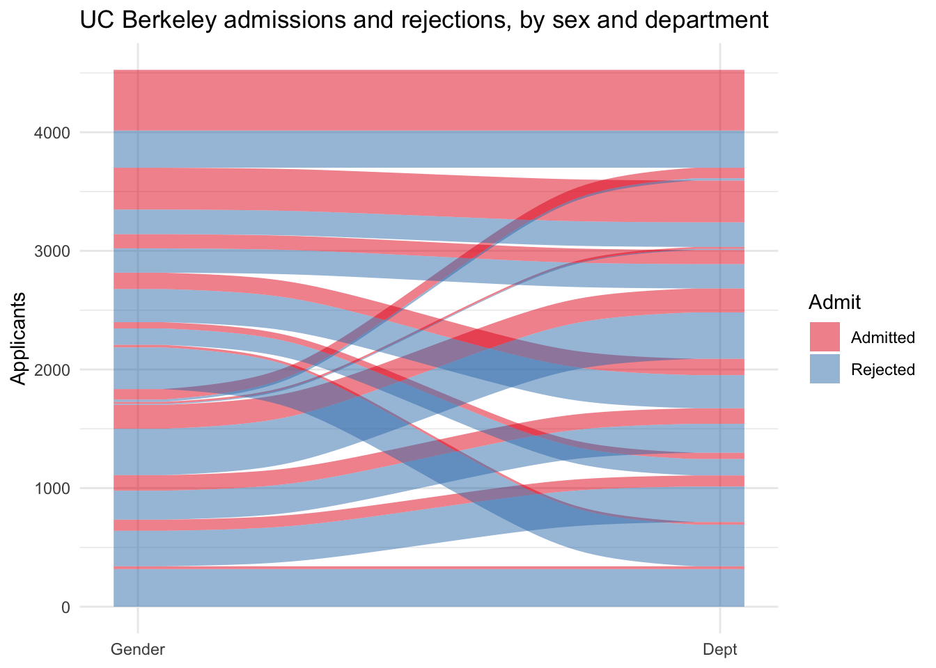
What can it do? It needs data. The y axis is always the total counts in the cells. Then we set axes with a number after to show the phases from left to right. So here, axis1 will be gender and axis two will be Department. Admitted and non-admitted students flowed with colors depicting them move through the system. We want to track them by their admitted status. The alluvial itself has y as Frequency and the various axis* as the phases to track. The outcome of interest enters the fill so that color shows the outcome of interest flowing through the strata.
With the system data
This is the vignette solution to these data with the package. Extending it to any data is a two step process.
UCBADF %>%ggplot(.,aes(y = Freq, axis1 = Gender, axis2 = Dept)) +geom_alluvium(aes(fill = Admit), width =1/12) +geom_stratum(width =1/12, fill ="black", color ="grey") +geom_label(stat ="stratum", label.strata =TRUE) +scale_x_discrete(limits =c("Gender", "Dept"), expand =c(.05, .05)) +# Fix the x axisscale_fill_brewer(type ="qual", palette ="Set1") +# Give it nice colorsggtitle("UC Berkeley admissions and rejections, by sex and department") +# give it a titlelabs(y="Applicants") +theme_minimal()
A simple one [or as simple as I can]
A lot of the code is just prettying. The most basic plot needs this:
ggplot(UCBADF, # plot the dataaes(y = Freq, axis1 = Gender, axis2 = Dept)) +# what are the named axesgeom_alluvium(aes(fill = Admit), width =1/12) +# what variable will fill the paths; Admission here.geom_stratum(width =1/12, fill ="black", color ="grey") +# This set the strata that our people will move through The one 12 is 12 combinations; the two colors here dfine the background and text for the labels.geom_label(stat ="stratum", label.strata =TRUE) # This labels them.
, , Age = Child, Survived = No

      Sex
Class  Male Female
  1st     0      0
  2nd     0      0
  3rd    35     17
  Crew    0      0

, , Age = Adult, Survived = No

      Sex
Class  Male Female
  1st   118      4
  2nd   154     13
  3rd   387     89
  Crew  670      3

, , Age = Child, Survived = Yes

      Sex
Class  Male Female
  1st     5      1
  2nd    11     13
  3rd    13     14
  Crew    0      0

, , Age = Adult, Survived = Yes

      Sex
Class  Male Female
  1st    57    140
  2nd    14     80
  3rd    75     76
  Crew  192     20
TDF <-as.data.frame(Titanic)TDF
   Class    Sex   Age Survived Freq
1    1st   Male Child       No    0
2    2nd   Male Child       No    0
3    3rd   Male Child       No   35
4   Crew   Male Child       No    0
5    1st Female Child       No    0
6    2nd Female Child       No    0
7    3rd Female Child       No   17
8   Crew Female Child       No    0
9    1st   Male Adult       No  118
10   2nd   Male Adult       No  154
11   3rd   Male Adult       No  387
12  Crew   Male Adult       No  670
13   1st Female Adult       No    4
14   2nd Female Adult       No   13
15   3rd Female Adult       No   89
16  Crew Female Adult       No    3
17   1st   Male Child      Yes    5
18   2nd   Male Child      Yes   11
19   3rd   Male Child      Yes   13
20  Crew   Male Child      Yes    0
21   1st Female Child      Yes    1
22   2nd Female Child      Yes   13
23   3rd Female Child      Yes   14
24  Crew Female Child      Yes    0
25   1st   Male Adult      Yes   57
26   2nd   Male Adult      Yes   14
27   3rd   Male Adult      Yes   75
28  Crew   Male Adult      Yes  192
29   1st Female Adult      Yes  140
30   2nd Female Adult      Yes   80
31   3rd Female Adult      Yes   76
32  Crew Female Adult      Yes   20
ggplot(TDF,aes(y = Freq, axis1 = Class, axis2 = Age, axis3 = Sex, axis4=Survived)) +geom_alluvium(aes(fill = Survived), width =1/24) +geom_stratum(width =1/12, fill ="white", color ="black") +geom_label(stat ="stratum", label.strata =TRUE) +scale_x_discrete(limits =c("Class", "Age", "Sex")) +# Fix the x axisscale_fill_brewer(type ="qual", palette ="Set1") +# Give it nice colorsggtitle("The Fate of Titanic Passengers", subtitle="Class, Sex, Age") # give it a title
Beyonce Palettes
Now for one better, we can combine variables. I will use the titanic data and combine Age and Sex into a new variable people. They will now flow through Class to Survival starting with four types of people. I recently discovered Beyonce palettes; I will use Beyonce 41 for this alluvial.
# devtools::install_github("dill/beyonce")library(beyonce)TDF2 <- TDF %>%mutate(People = Sex:Age, AgeS = Age:Survived)ggplot(TDF2,aes(y = Freq, axis1 = People, axis2 = Class, axis3=Survived)) +geom_alluvium(aes(fill = AgeS), width =1/24) +geom_stratum(width =1/12, fill ="white", color ="black") +geom_label(stat ="stratum", label.strata =TRUE) +scale_x_discrete(limits =c("People", "Class", "Survived")) +# Fix the x axisscale_fill_manual(values =beyonce_palette(41)) +# Give it nice colorsggtitle("The Fate of Titanic Passengers", subtitle="Class, People") +# give it a titletheme_minimal()