The Economist’s Errors and Credit Where Credit is Due
The Economist is serious about their use of data visualization and they have occasionally owned up to errors in their visualizations. They can be deceptive, uninformative, confusing, excessively busy, and present a host of other barriers to clean communication. Their blog post on their errors is great.
I have drawn the following example from a #tidyTuesday earlier this year that explores this. Here is the link to the setup page.
Your Task
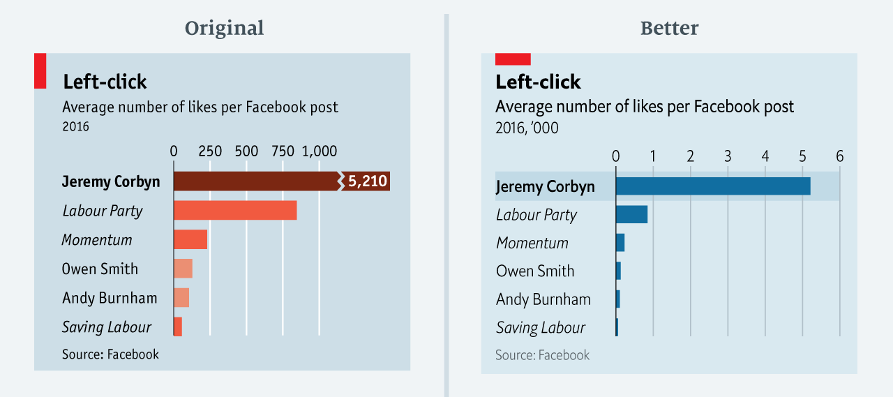
Your task comes in two parts. The first one is to recreate any of the second through sixth visualizations: Brexit, Dogs, EU Balance, Pensions, or Trade. You should have a look at the original and note the pathologies, but reproduce a nice visual (either their reconceptualization or something useful). One thing to note is that three axis graphics are almost always bad.
A Template
For example, the first one; the example is bad because it cuts the axis.
A Bad Graphic
My Re-creation [in Labour red]
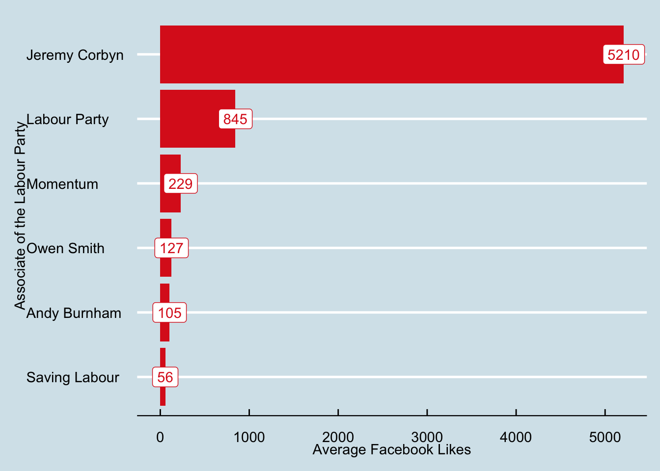
I built the whole thing in equisse with two exceptions. First, reorder here is used to arrange the names in the order that I want to plot them. By default they are alphabetical. Second, I wanted the label geometry which is not an option in esquisse but one treats it like a point with the text as the plotting character. In the aesthetic, it is a label; geom_text does the same thing without a box but it harder to distinguish in this case. If you want to play, the cheat sheet is here.
Code
library(tidyverse) # call the tidyverse for %>% and ggplotlibrary(ggthemes) # Use the economist themelibrary(ggiraph)corbyn <- readr::read_csv("https://raw.githubusercontent.com/rfordatascience/tidytuesday/master/data/2019/2019-04-16/corbyn.csv")# reorder will allow me to sort the names by the values.# Uncomment to see: # with(corbyn, reorder(political_group,avg_facebook_likes))# geom_label will allow me to put the numbers on the graph by specifying a label.CFLplot1 <-ggplot(corbyn, aes(x=reorder(political_group,avg_facebook_likes), y=avg_facebook_likes, label=avg_facebook_likes)) +geom_bar(stat="identity", fill="#DC241f") +geom_label(color="#DC241f") +labs(x="Associate of the Labour Party", y="Average Facebook Likes") +theme_economist() +coord_flip()CFLplot1
Code
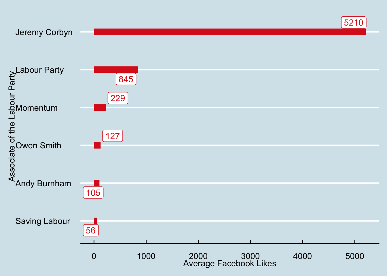
library(ggrepel)library(tidyverse) # call the tidyverse for %>% and ggplotlibrary(ggthemes) # Use the economist themecorbyn <- readr::read_csv("https://raw.githubusercontent.com/rfordatascience/tidytuesday/master/data/2019/2019-04-16/corbyn.csv")# reorder will allow me to sort the names by the values.# Uncomment to see: # with(corbyn, reorder(political_group,avg_facebook_likes))# geom_label will allow me to put the numbers on the graph by specifying a label.CFLplot2 <-ggplot(corbyn, aes(x=reorder(political_group,avg_facebook_likes), y=avg_facebook_likes, label=avg_facebook_likes)) +geom_segment(aes(yend=0, xend=political_group), size=4, color="#DC241f") +geom_label_repel(color="#DC241f", size=4) +labs(x="Associate of the Labour Party", y="Average Facebook Likes") +theme_economist() +coord_flip()CFLplot2
Code
p1.Int <-ggplot(corbyn, aes(x=reorder(political_group,avg_facebook_likes), data_id=political_group, y=avg_facebook_likes, label=avg_facebook_likes, tooltip =paste0(political_group,"<br>",avg_facebook_likes, sep=""))) +geom_bar_interactive(stat="identity", fill="#DC241f") +geom_label(fill="#DC241f", color="#FFFFFF", size=3.5) +labs(x="Associate of the Labour Party", y="Average Facebook Likes") + hrbrthemes::theme_ipsum_rc() +coord_flip()p2.Int <-ggplot(corbyn, aes(x=reorder(political_group,avg_facebook_likes), y=avg_facebook_likes, label=avg_facebook_likes, data_id=political_group, tooltip =paste0(political_group,"<br>",avg_facebook_likes, sep=""))) +geom_segment_interactive(aes(yend=0, xend=political_group), size=2, color="#DC241f") +geom_point(size=10, color="#DC241f", alpha=0.8) +geom_text(color="#FFFFFF", size=3.5, fontface=2) +labs(x="Associate of the Labour Party", y="Average Facebook Likes") + hrbrthemes::theme_ipsum_rc() +coord_flip()library(patchwork)GIp1 <- p1.Int / p2.Intgirafe(ggobj=GIp1)
Your Turn
In the next code chunk, you will need to cut and paste the code for grabbing your particular choice of data.
date percent_responding_right percent_responding_wrong
Length:85 Min. :40.00 Min. :41.00
Class :character 1st Qu.:42.00 1st Qu.:43.00
Mode :character Median :44.00 Median :45.00
Mean :43.71 Mean :44.51
3rd Qu.:45.00 3rd Qu.:45.00
Max. :47.00 Max. :48.00
Code
# The variable names are too long and terrible. Let me change them.names(brexit) <-c("Date","Right","Wrong")# The dates are also not read as proper dates. Let me fix that. It can also be fixed by coercion in esquissebrexit$Date <-as.Date(brexit$Date, "%d/%m/%y")brexit
The data are structured side by side and that makes it hard for R [or anything] to draw axes because it needs to know the boundaries for the axes. I need to stack the rights and wrongs into one column with an associated label in another column for Right and Wrong. That is reshaping data; pivoting longer and wider in the language of tidyr.
Code
# My first step is to stack the percent reporting on top of each other to make color and fill work properly. I am going to take wider data [two columns of data] and stack them on top of each other. What am I going to name this new stacked column? "direction" and which columns do I wish to stack? c(Right,Wrong)My.Brexit <- brexit %>%pivot_longer(.,names_to ="direction",cols =c(Right,Wrong))My.Brexit
Code
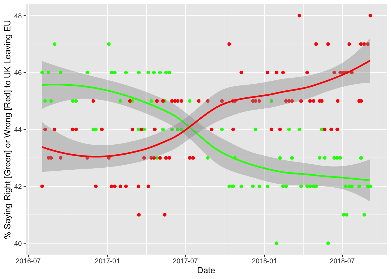
brexit %>%ggplot(aes(x=Date, y=Right)) +geom_smooth(color="green", size=1) +geom_point(color ="green") +geom_point(aes(x=Date, y=Wrong), color="red") +geom_smooth(aes(x=Date, y=Wrong), color="red") +labs(y="% Saying Right [Green] or Wrong [Red] to UK Leaving EU")
Your Graphic
Code
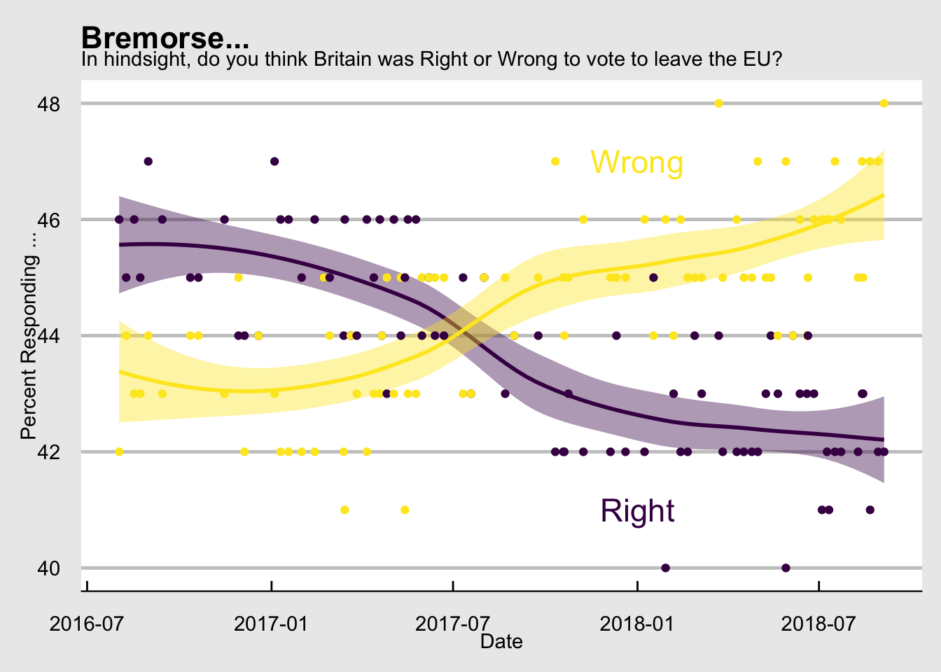
# The only addition beyond esquisse here is the addition of geom_smooth that gives me the smmoth intervals and annotate to write the sides in the graph instead of the legend..ggp <- My.Brexit %>%ggplot(aes(x = Date, y = value, color=direction, fill = direction)) +geom_smooth(size = 1L) +geom_point(size=1.5) +scale_color_viridis_d(name="Direction", guide =FALSE) +scale_fill_viridis_d(name="Direction", guide =FALSE) +theme_economist_white() +labs(title="Bremorse...", subtitle ="In hindsight, do you think Britain was Right or Wrong to vote to leave the EU?", x="Date", y ="Percent Responding ...") +# add two annotations to the plot instead of a scaleannotate("text" , x=as.Date("2018-01-01"), y=47, label="Wrong", size=6, color ="#fde725ff") +annotate("text" , x=as.Date("2018-01-01"), y=41, label="Right", size=6, color ="#440154ff")ggp
That’s pretty cool.
Pensions
Code
library(ggrepel) # I need to repel the labels.pensions <- readr::read_csv("https://raw.githubusercontent.com/rfordatascience/tidytuesday/master/data/2019/2019-04-16/pensions.csv")pensions$scaled.65<-scale(pensions$pop_65_percent)pensions$scaled.GSgdp <-scale(pensions$gov_spend_percent_gdp)pensions$prod.scaled <- pensions$scaled.65*pensions$scaled.GSgdp
Now a picture. I want it simple but complete. At first, I used text but it is not easy to read.
Code
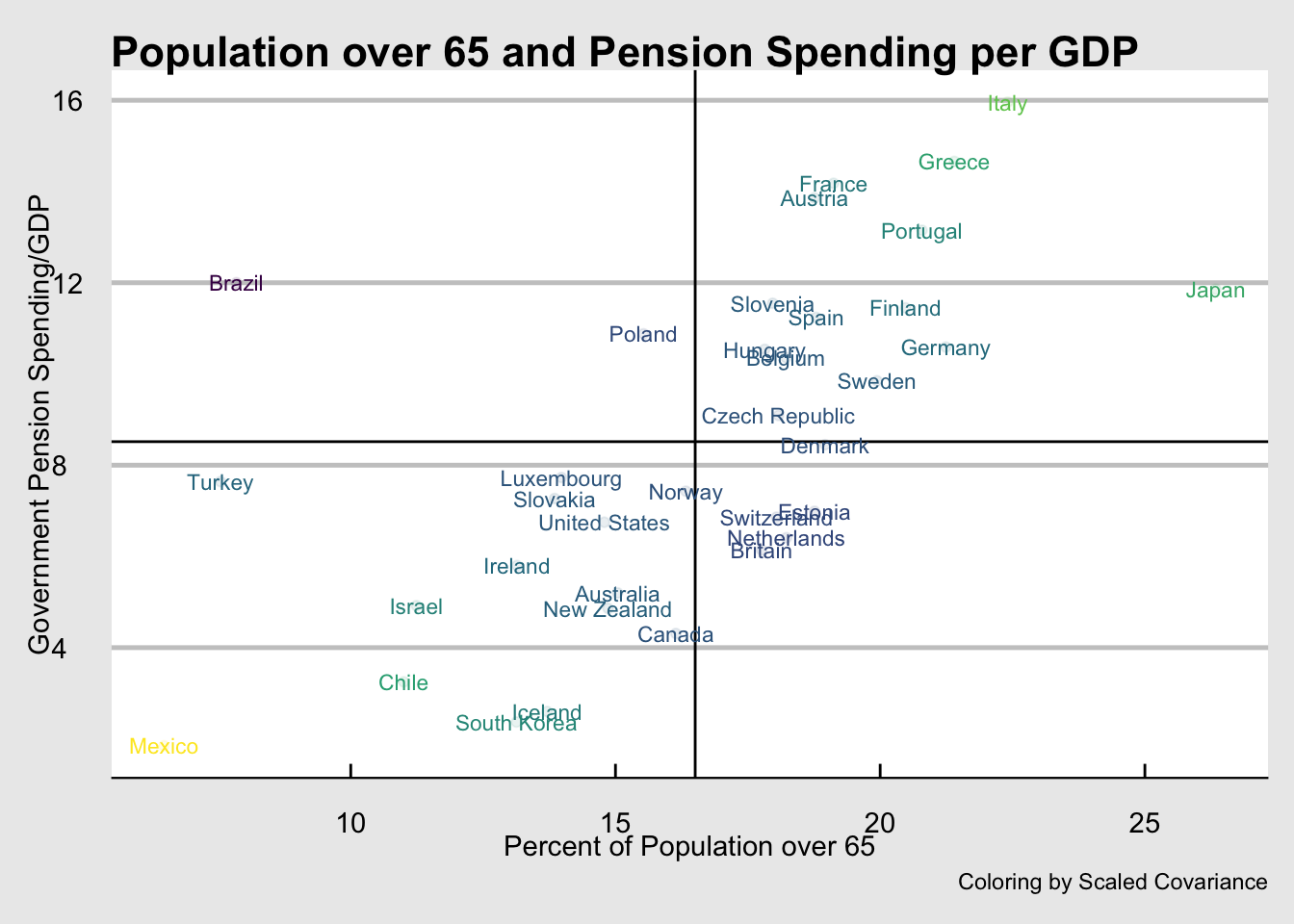
pensions <- pensions %>%mutate(Mean65 =mean(pop_65_percent), MeanSpend =mean(gov_spend_percent_gdp)) pensions %>%ggplot(., aes(x=pop_65_percent, y=gov_spend_percent_gdp, label=country, color=prod.scaled)) +geom_point(alpha=0.1) +geom_hline(yintercept =mean(pensions$MeanSpend)) +geom_vline(xintercept =mean(pensions$Mean65)) +geom_text(size=3, fill="white") +labs(x="Percent of Population over 65", y="Government Pension Spending/GDP") +theme_economist_white() +labs(title="Population over 65 and Pension Spending per GDP", caption ="Coloring by Scaled Covariance") +scale_color_viridis_c(guide=FALSE)
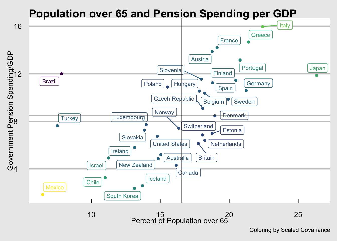
**ggrepel* allows labels that arrow to plot locations and keeps the labels from overlapping. I called the library earlier, now I will use it’s geom called geom_label_repel.
Code
ggplot(pensions) +aes(x=pop_65_percent, y=gov_spend_percent_gdp, label=country, color=prod.scaled) +geom_label_repel(size=3, fill="white") +labs(x="Percent of Population over 65", y="Government Pension Spending/GDP") +geom_point() +geom_hline(yintercept =mean(pensions$MeanSpend)) +geom_vline(xintercept =mean(pensions$Mean65)) +theme_economist_white() +labs(title="Population over 65 and Pension Spending per GDP", caption ="Coloring by Scaled Covariance") +scale_color_viridis_c(guide=FALSE)
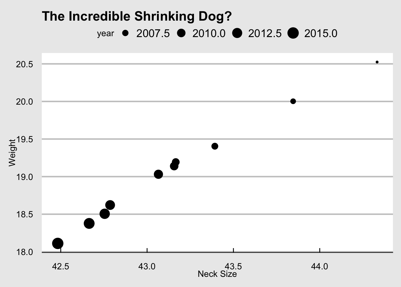
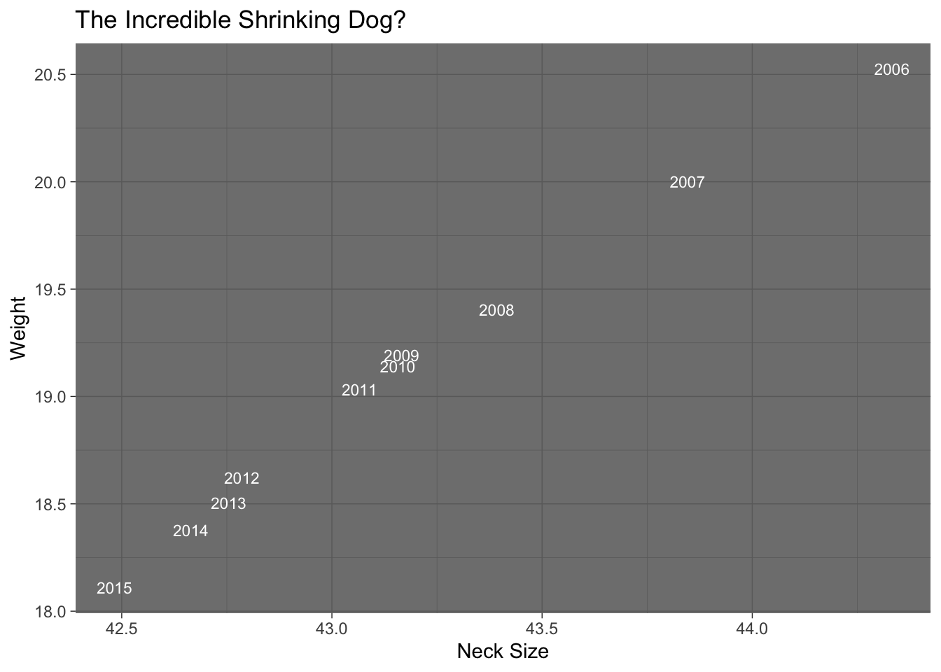
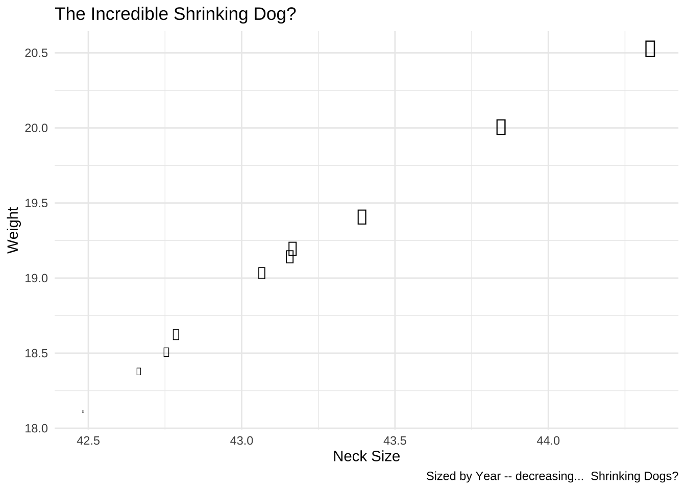
This is a perfect case for a text label. If they are decent sized, they overlap. I used geom_text which requires a label [label = year] in the aesthetic mapping.
Code
p <-ggplot(dogs) +aes(x=avg_neck, y=avg_weight, label=year) +geom_text(size=3, color="white") +theme_dark() +labs(x="Neck Size", y="Weight", title="The Incredible Shrinking Dog?") p
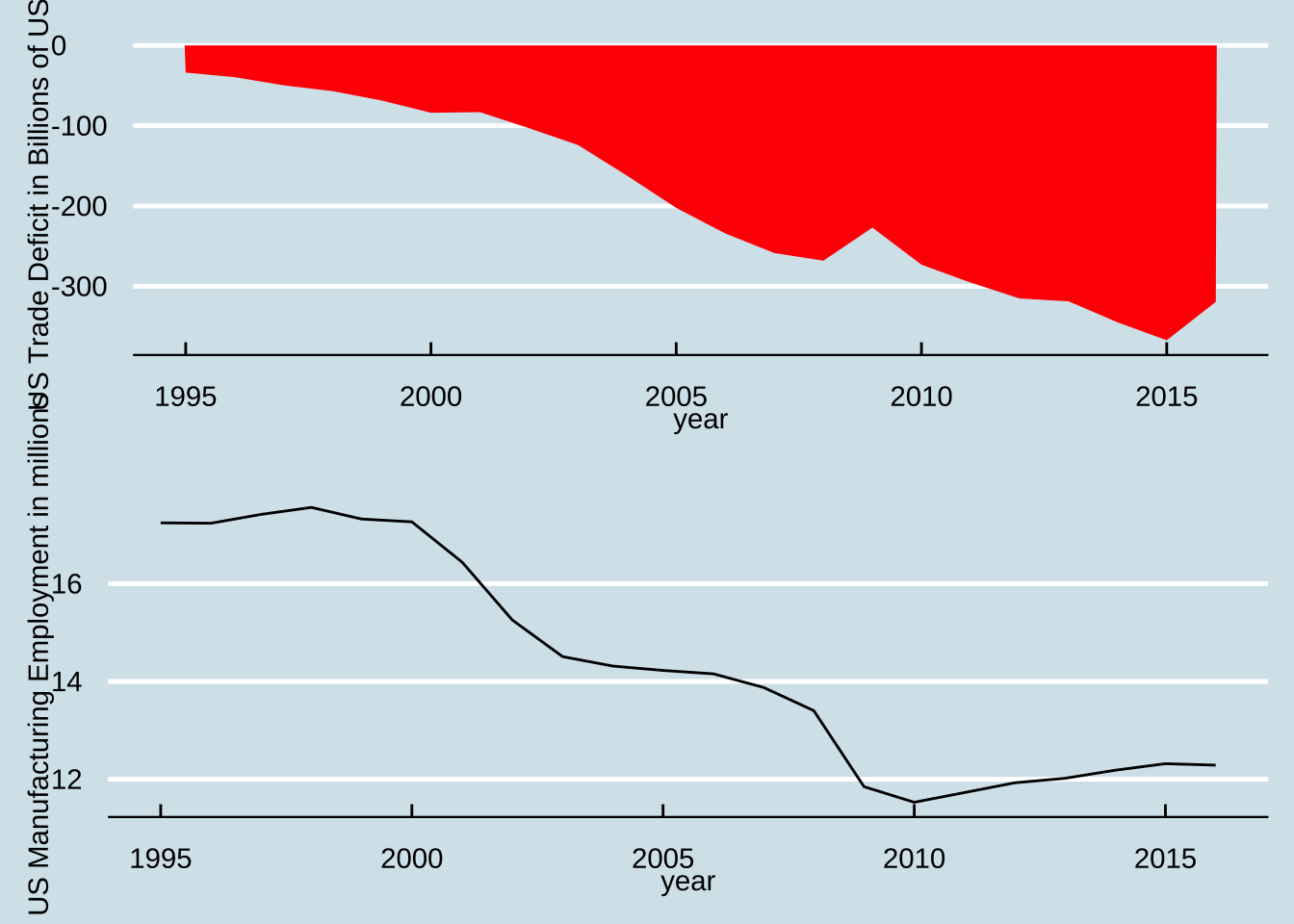
p1 <-ggplot(trade, aes(x=year, y=trade_deficit/1000000000)) +geom_area(fill="red") +theme_economist() +labs(y ="US Trade Deficit in Billions of US $")p2 <-ggplot(trade, aes(x=year, y=manufacture_employment/1000000)) +geom_line() +theme_economist() +labs(y ="US Manufacturing Employment in millions")grid.arrange(p1,p2)
That is fairly simple and it works. The trick here was to use a grid to create two plots and stack them.
The Last One: No Solution Provided
The authors of the post give you good advice on how to solve this. I contend that there is a great plot to generate using esquisse though it may not be just one plot. Have a go. If you wish to, you can peruse the appropriate timelines for #tidyTuesday and see what people came up with though in many cases, this will be apparent so use appropriate citations; it is easy to do with the examples here in this Markdown.
# There's a spelling error I want to fix, select the rows and columns to fix and reassign the valuewomen_research[women_research$field=="Women inventores","field"] <-"Women Inventors"# The label for CS/Maths is too long, alsowomen_research[women_research$field=="Computer science, maths","field"] <-"CS/Math"
The data consist of three columns and are a long pivot table. The pivots are country and field with a quantitative indicator of the percent of women in the field. It is a long pivot table characterised by country and field combinations in the rows. To show the data cleanly, let me spread out the fields by widening the pivot table by fields.
Code
# I find it far more intuitive to use pivot_wider but this will always work and is safer on versions of tidyr# women_research %>% pivot_wider(field, percent_women) women_research %>%spread(field, percent_women) %>% knitr::kable()
country
CS/Math
Engineering
Health sciences
Physical sciences
Women Inventors
Australia
0.24
0.25
0.50
0.23
0.12
Brazil
0.24
0.32
0.57
0.33
0.19
Canada
0.22
0.22
0.49
0.21
0.13
Chile
0.16
0.22
0.43
0.23
0.19
Denmark
0.18
0.23
0.47
0.22
0.13
EU28
0.22
0.25
0.48
0.25
0.12
France
0.22
0.25
0.48
0.24
0.17
Japan
0.11
0.11
0.24
0.11
0.08
Mexico
0.22
0.26
0.46
0.25
0.18
Portugal
0.27
0.36
0.57
0.37
0.26
United Kingdom
0.21
0.22
0.45
0.21
0.12
United States
0.22
0.22
0.46
0.20
0.14
Visualize it…
The first way is to use esquisse and a simple grid plot for two categorical axes and add details to it in the boxes.
Code
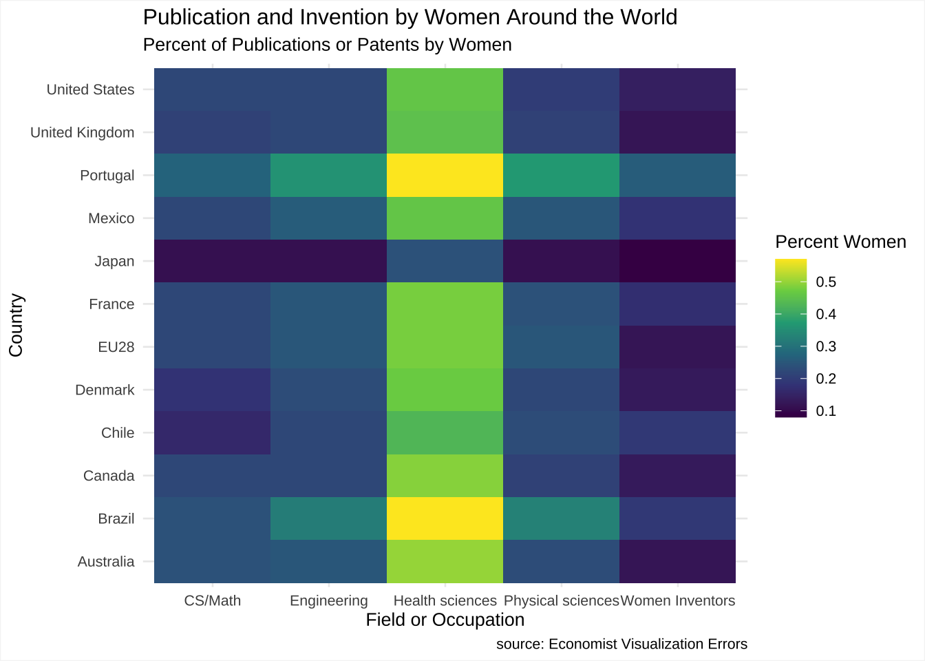
ggp1 <-ggplot(women_research) +aes(x = field, y = country, fill = percent_women) +geom_tile(size = 1L) +scale_fill_viridis_c(option ="viridis") +labs(x ="Field or Occupation", y ="Country", title ="Publication and Invention by Women Around the World", subtitle ="Percent of Publications or Patents by Women", caption ="source: Economist Visualization Errors", fill ="Percent Women") +theme_minimal(base_size =10)ggp1 +theme(plot.background =element_rect(colour ="whitesmoke"))
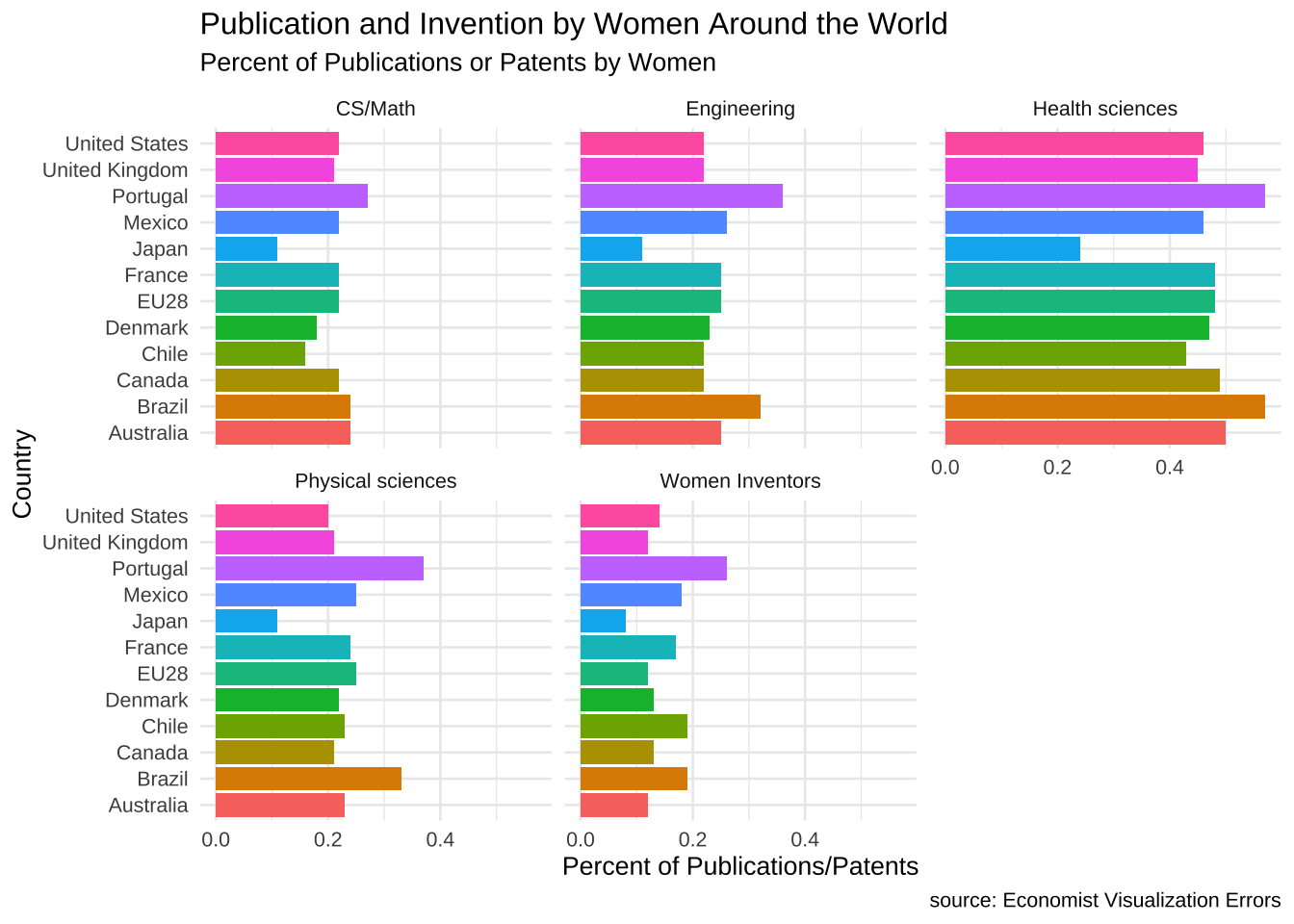
We can also use equisse to build a faceted barplot by dragging the field to facet. X is country, y is percent women, fill is country with facets determined by fields.
Code
women_research %>%ggplot(.) +aes(x = country, fill = country, weight = percent_women) +geom_bar() +scale_fill_hue() +coord_flip() +theme_minimal(base_size =10) +theme(legend.position ="none") +labs(y ="Percent of Publications/Patents", x ="Country", title ="Publication and Invention by Women Around the World", subtitle ="Percent of Publications or Patents by Women", caption ="source: Economist Visualization Errors") +facet_wrap(vars(field))
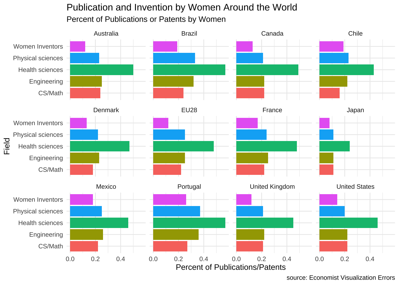
Or reverse the above use of field and country where field is the X and the fill, y is still percent_women and facets are now countries. This works quite well if only because there are 12 entities which grid into a 3 x 4 nicely.
Code
women_research %>%ggplot(.) +aes(x = field, fill = field, weight = percent_women) +geom_bar() +scale_fill_hue() +coord_flip() +theme_minimal(base_size =10) +theme(legend.position ="none") +labs(y ="Percent of Publications/Patents", x ="Field", title ="Publication and Invention by Women Around the World", subtitle ="Percent of Publications or Patents by Women", caption ="source: Economist Visualization Errors") +facet_wrap(~country)
To show something very cool that R can do, I have added one more bit that is turned off. In the following code chunk, I use eval=FALSE to avoid evaluating the chunk in R. If the FALSE is changed to TRUE, R will need ggiraph via install.packages("ggiraph").
Code
library(ggiraph)women_research <- women_research %>%group_by(country) %>%mutate(Avg.Women.Percent =mean(percent_women)) %>%ungroup()women_research$PercentWomen <-as.character(round(women_research$percent_women, 3))p1 <-ggplot(women_research) +aes(x =reorder(country,Avg.Women.Percent), fill = country, weight = percent_women, tooltip = PercentWomen, data_id = country) +geom_bar_interactive() +scale_fill_viridis_d(option ="cividis") +guides(fill=FALSE) +coord_flip() +theme_minimal() +theme(axis.text.y =element_text(angle =45, hjust =1, size=6)) +labs(y ="Percent of Publications/Patents", x ="Country/Group", fill="Country/Grouping", title ="Publication and Invention by Women Around the World", subtitle ="Percent of Publications or Patents by Women", caption ="source: Economist Visualization Errors") +facet_wrap(~field)girafe(code =print(p1))
Code
library(patchwork)ggp1.changed <-ggplot(women_research) +aes(x = field, y = country, fill = percent_women, , data_id = country, tooltip=percent_women) +geom_tile_interactive(size = 1L) +scale_fill_viridis_c(option="cividis") +labs(x ="Field or Occupation", y ="Country", fill ="% Women") +theme_minimal(base_size =10)ggp1.changed <- ggp1.changed +theme(plot.background =element_rect(colour ="whitesmoke"))comb1 <- p1 / ggp1.changedgirafe(code =print(comb1))
A Brief Crosstalk
Getting this to work wasn’t hard. Getting it to style properly in interaction with the bootstrap frame was a pain. I finally just went with a blank column in two places to make sure that names don’t get cut off.
Code
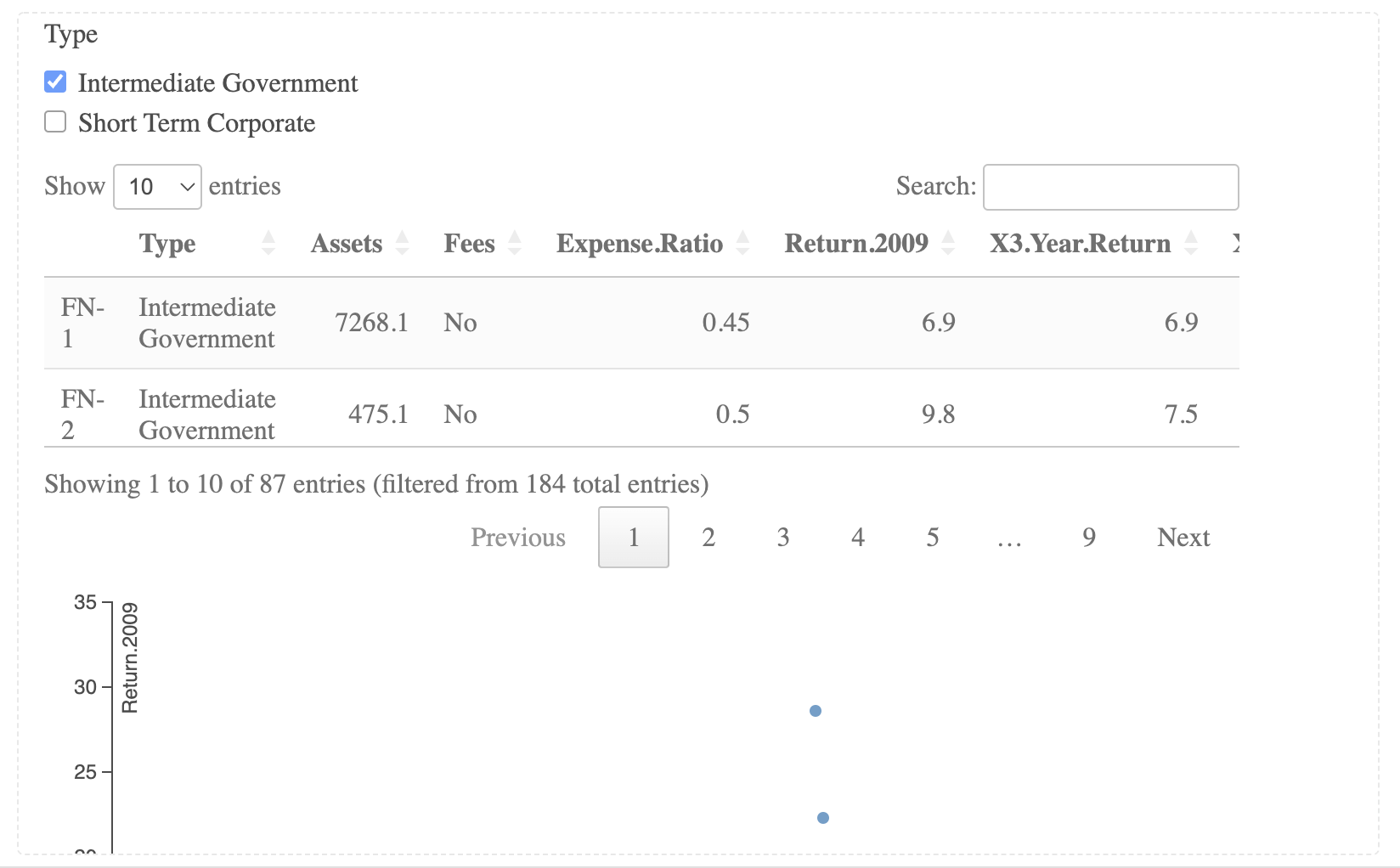
library(htmltools)library(crosstalk)library(DT)library(d3scatter)# Load the dataBonds <-read.csv(url("https://github.com/robertwwalker/DADMStuff/raw/master/BondFunds.csv"), row.names=1)# Turn characters into factorsBonds <- Bonds %>%mutate(Fees =as.factor(Fees), Risk =as.factor(Risk), Type =as.factor(Type))# Create shared data objectshared_bonds <- SharedData$new(Bonds)# Generate the bootsrap columns as three rows, page is 12 widebscols(widths=c(12,12,12),# A d3 visualizationd3scatter(shared_bonds, ~Expense.Ratio, ~Return.2009, ~Risk),# The filter checkboxeslist(filter_checkbox("Fees", "Fees", shared_bonds, ~Fees, inline=TRUE),filter_checkbox("Type", "Type", shared_bonds, ~Type, inline=TRUE),filter_checkbox("Fees", "Risk", shared_bonds, ~Risk, inline=TRUE)),# The datatabledatatable(shared_bonds))
Without the bootstrap formatting of the webpage, it works much better.
image
The Fix for the cutoff parts
The trick to getting this to display properly was a blank column with width=1.
Code
shared_bonds2 <- SharedData$new(Bonds)# This was adjusted from abovebscols(widths=c(12,1,11,1,11),d3scatter(shared_bonds2, ~Expense.Ratio, ~Return.2009, ~Risk),"", # First blank columnlist(filter_checkbox("Fees", "Fees", shared_bonds2, ~Fees, inline=TRUE),filter_checkbox("Type", "Type", shared_bonds2, ~Type, inline=TRUE),filter_checkbox("Fees", "Risk", shared_bonds2, ~Risk, inline=TRUE)),"", # Second blank columndatatable(shared_bonds2))
Wickham, Hadley, Mara Averick, Jennifer Bryan, Winston Chang, Lucy D’Agostino McGowan, Romain François, Garrett Grolemund, et al. 2019. “Welcome to the tidyverse.”Journal of Open Source Software 4 (43): 1686. https://doi.org/10.21105/joss.01686.
Wickham, Hadley, Winston Chang, Lionel Henry, Thomas Lin Pedersen, Kohske Takahashi, Claus Wilke, Kara Woo, Hiroaki Yutani, and Dewey Dunnington. 2023. Ggplot2: Create Elegant Data Visualisations Using the Grammar of Graphics. https://CRAN.R-project.org/package=ggplot2.
Wickham, Hadley, Romain François, Lionel Henry, Kirill Müller, and Davis Vaughan. 2023. Dplyr: A Grammar of Data Manipulation. https://CRAN.R-project.org/package=dplyr.