Bonds <- read.csv(url("https://raw.githubusercontent.com/robertwwalker/DADMStuff/master/BondFunds.csv"))Bonds
A dataset for illustrating the various available visualizations needs a certain degree of richness with manageable size. The dataset on Bonds contains three categorical and a few quantitative indicators sufficient to show what we might wish.
Loading the Data
A Summary
library(skimr)
Bonds %>%
skim()| Name | Piped data |
| Number of rows | 184 |
| Number of columns | 9 |
| _______________________ | |
| Column type frequency: | |
| character | 4 |
| numeric | 5 |
| ________________________ | |
| Group variables | None |
Variable type: character
| skim_variable | n_missing | complete_rate | min | max | empty | n_unique | whitespace |
|---|---|---|---|---|---|---|---|
| Fund.Number | 0 | 1 | 4 | 6 | 0 | 184 | 0 |
| Type | 0 | 1 | 20 | 23 | 0 | 2 | 0 |
| Fees | 0 | 1 | 2 | 3 | 0 | 2 | 0 |
| Risk | 0 | 1 | 7 | 13 | 0 | 3 | 0 |
Variable type: numeric
| skim_variable | n_missing | complete_rate | mean | sd | p0 | p25 | p50 | p75 | p100 | hist |
|---|---|---|---|---|---|---|---|---|---|---|
| Assets | 0 | 1 | 910.65 | 2253.27 | 12.40 | 113.72 | 268.4 | 621.95 | 18603.50 | ▇▁▁▁▁ |
| Expense.Ratio | 0 | 1 | 0.71 | 0.26 | 0.12 | 0.53 | 0.7 | 0.90 | 1.94 | ▂▇▅▁▁ |
| Return.2009 | 0 | 1 | 7.16 | 6.09 | -8.80 | 3.48 | 6.4 | 10.72 | 32.00 | ▁▇▅▁▁ |
| X3.Year.Return | 0 | 1 | 4.66 | 2.52 | -13.80 | 4.05 | 5.1 | 6.10 | 9.40 | ▁▁▁▅▇ |
| X5.Year.Return | 0 | 1 | 3.99 | 1.49 | -7.30 | 3.60 | 4.3 | 4.90 | 6.80 | ▁▁▁▅▇ |
Most data types are represented. There is no time variable so dates and the visualizations that go with time series are omitted. It is worth noting that many of these variables contain significant skew. For example, the mean of Assets is larger than 75% of the values. There are a small number of huge funds.
Data Visualization
First, let us look at visualizations for one quantitative variable. Let me focus on assets, with the previous caveat in mind.
geom_histogram()
A histogram divides the data into categories and counts the observations per category. The width of the categories [on x] is determined by binwidth= or the binwidth can be calculated as a function of the range and the number of bins bin=. I will define it as Gen.Hist.
A Base Histogram
Gen.Hist <- Bonds %>%
    ggplot() + aes(x = Assets) + geom_histogram()
Gen.Hist
`stat_bin()` using `bins = 30`. Pick better value with `binwidth`.
Histograms [bins]
We can choose more bins. 50? That is far more than the default of 30.
Bin50.Hist <- Bonds %>%
    ggplot() + aes(x = Assets) + geom_histogram(bins = 50)
Bin50.Hist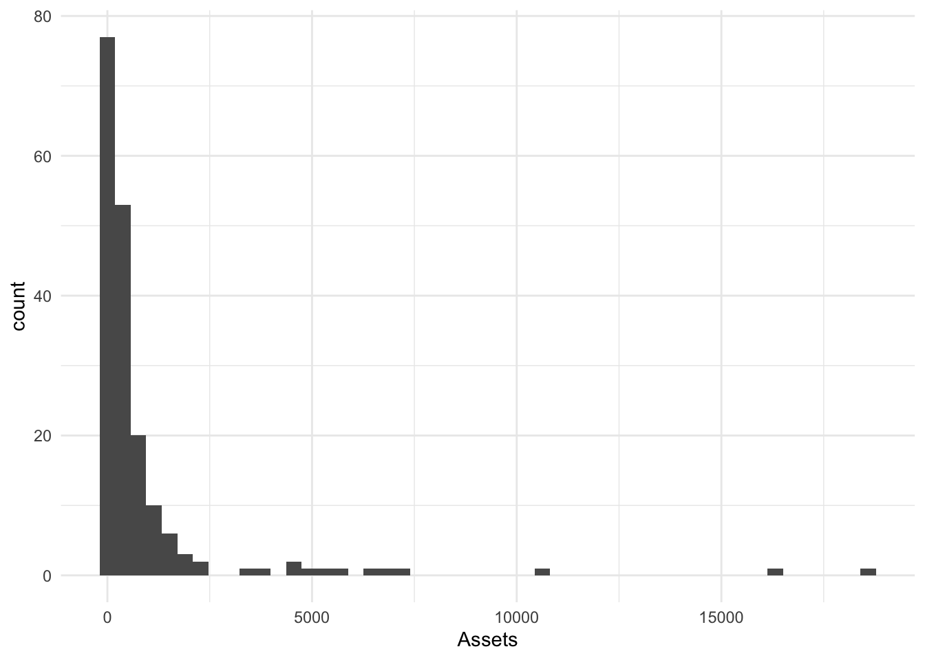
We can also choose fewer bins. I will choose 10.
Bin10.Hist <- Bonds %>%
    ggplot() + aes(x = Assets) + geom_histogram(bins = 10)
Bin10.Hist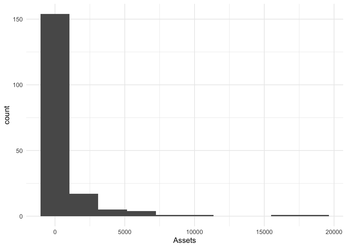
Histograms [binwidth]
We can also set the width of bins in the metric of x; I will choose 500 (bigger).
BinW500.Hist <- Bonds %>%
    ggplot() + aes(x = Assets) + geom_histogram(binwidth = 500)
BinW500.Hist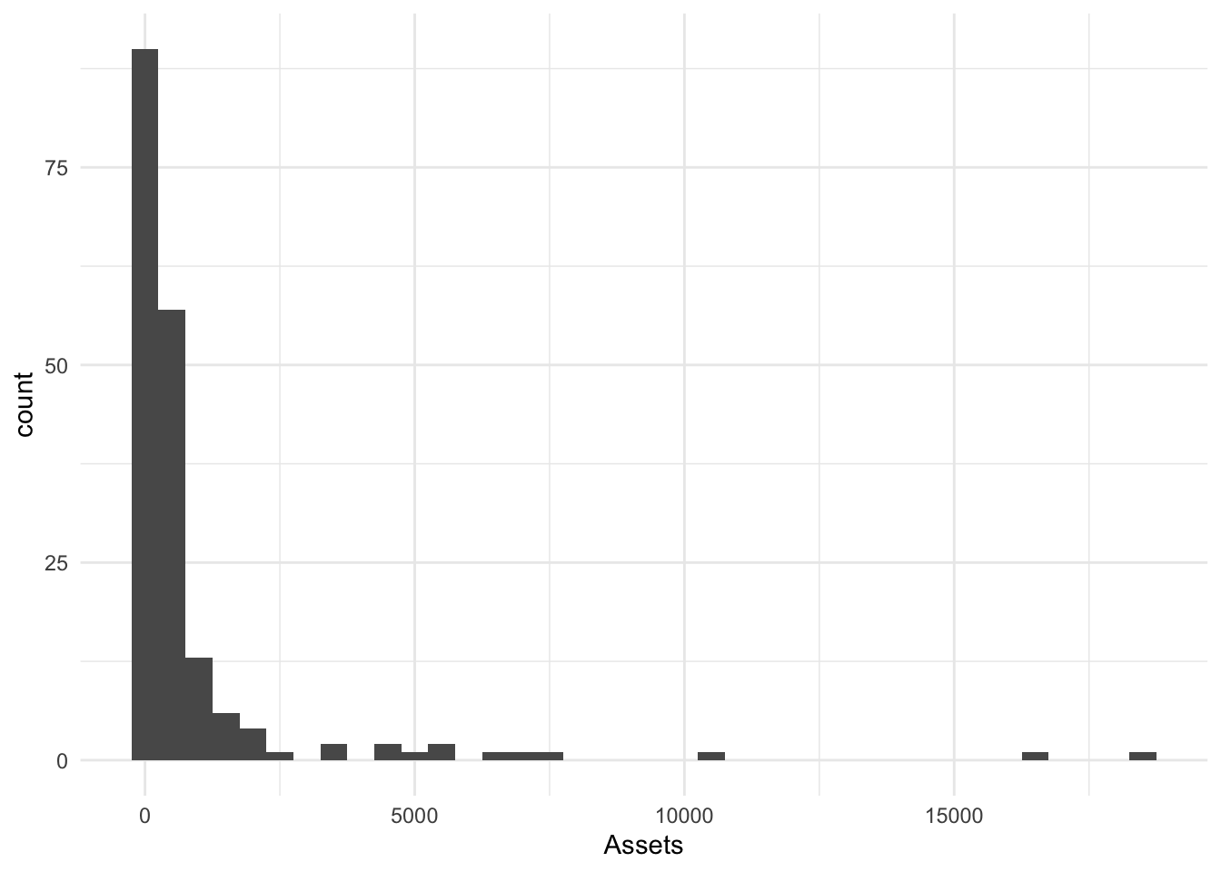
We can also set the width of bins in the metric of x; I will choose 50 (smaller width makes more bins).
BinW50.Hist <- Bonds %>%
    ggplot() + aes(x = Assets) + geom_histogram(binwidth = 50)
BinW50.Hist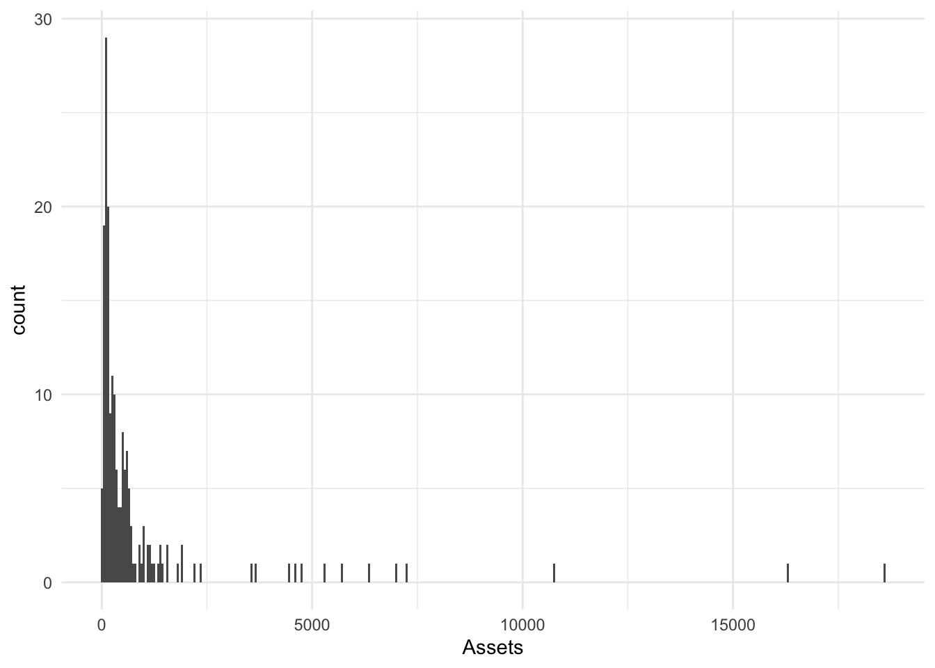
geom_dotplot()
geom_dotplot() places a dot for every observation in the relevant bin. We can control the size of the bins [in the original metric] with binwidth=.
Small binwidth
Bonds %>%
    ggplot() + aes(x = Assets) + geom_dotplot(binwidth = 10)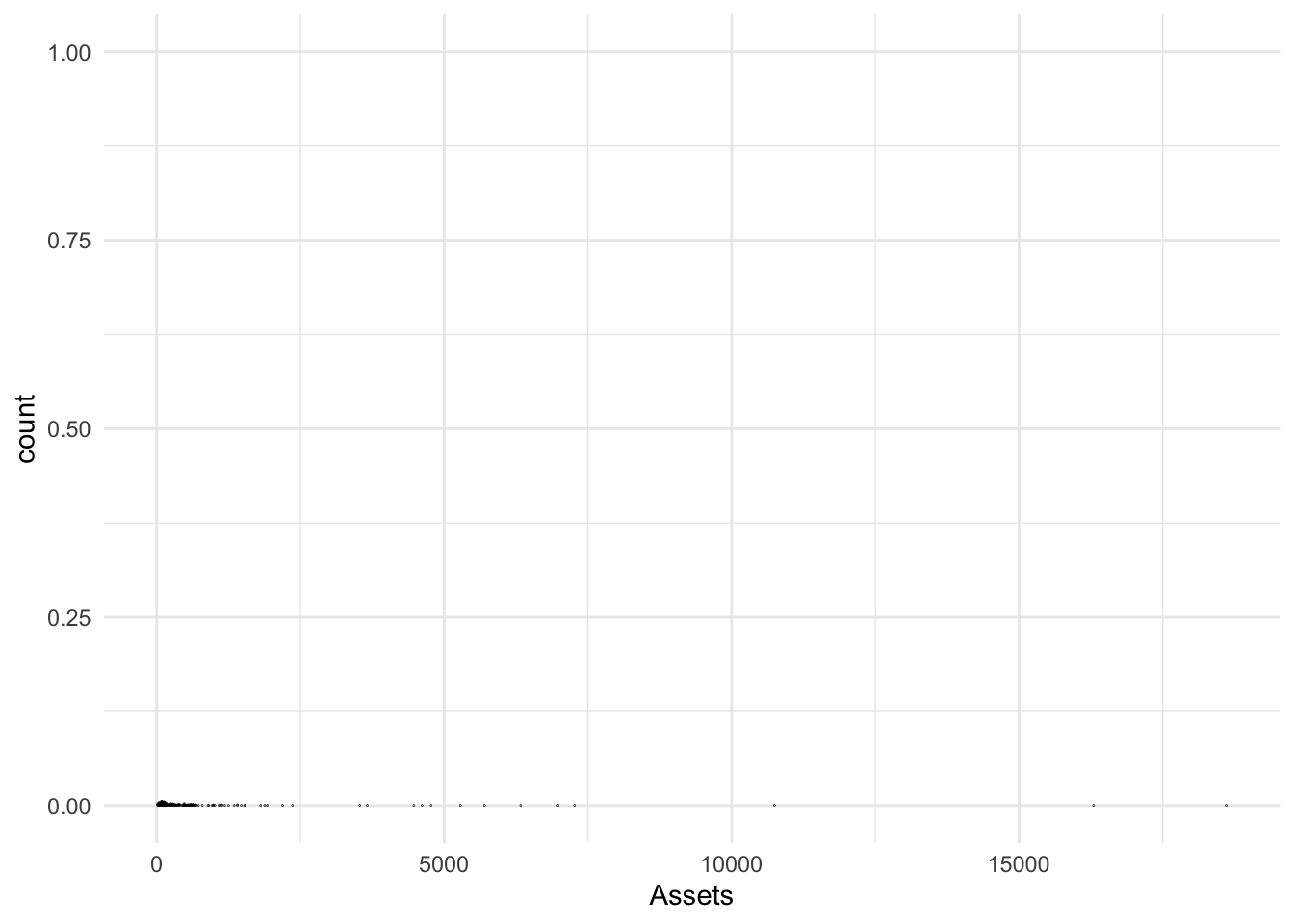
Large binwidth
Bonds %>%
    ggplot() + aes(x = Assets) + geom_dotplot(binwidth = 1000)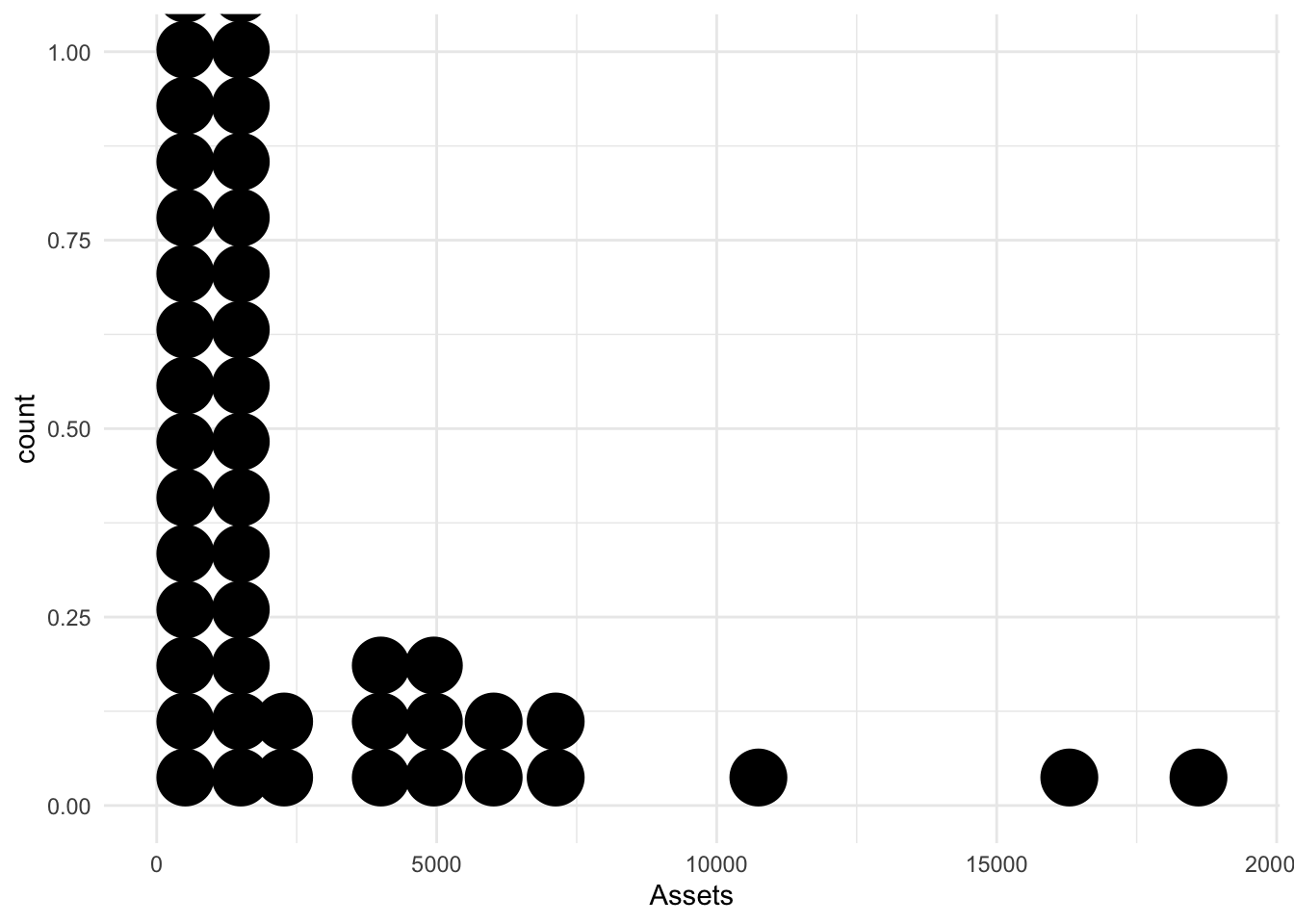
An ?optimal? binwidth
Each dot represents a datum with bins of size 100.
Bonds %>%
    ggplot() + aes(x = Assets) + geom_dotplot(binwidth = 100) + labs(y = "")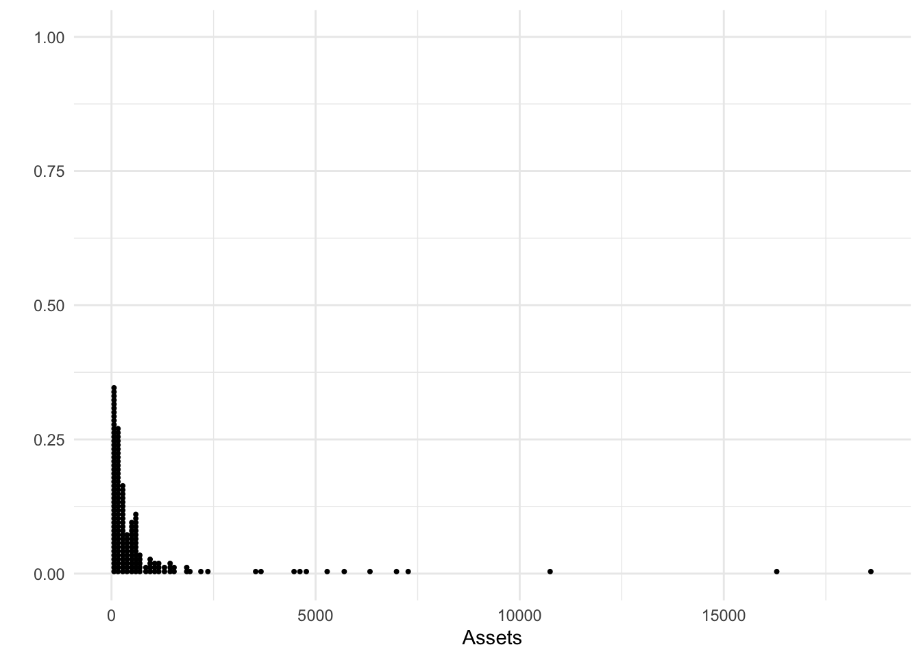
geom_freqpoly()
geom_freqpoly() is the line equivalent of a histogram. The arguments are similar, the output doesn’t include the bars as it does in the histogram.
Bonds %>%
    ggplot(., aes(x = Assets)) + geom_freqpoly()
`stat_bin()` using `bins = 30`. Pick better value with `binwidth`.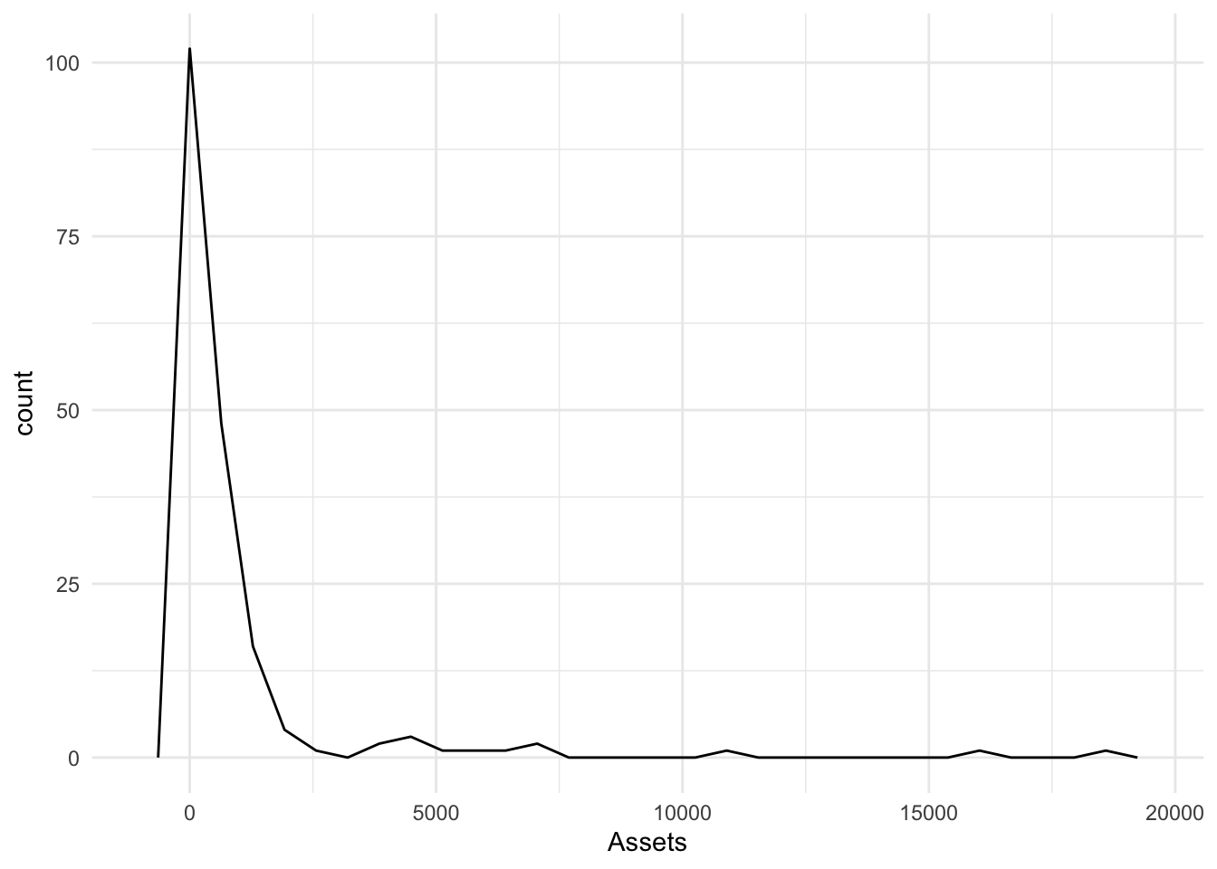
More bins
Bonds %>%
    ggplot(., aes(x = Assets)) + geom_freqpoly(bins = 50)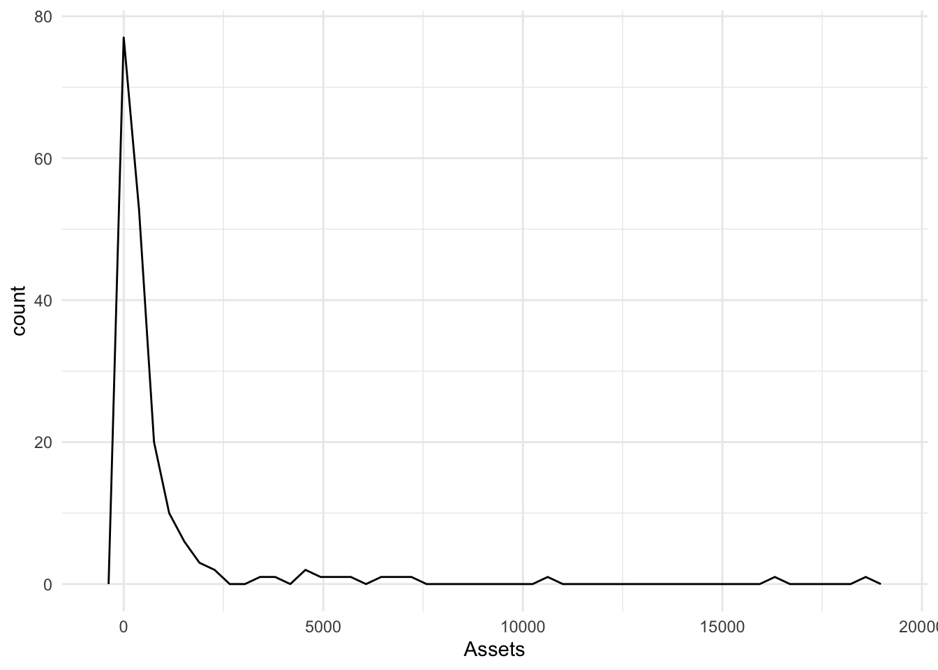
Fewer bins
Bonds %>%
    ggplot(., aes(x = Assets)) + geom_freqpoly(bins = 10)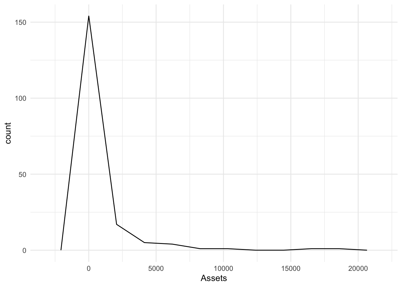
geom_area()
Is a relative of the histogram with lines connecting the midpoints of the bins and an associated fill from zero.
Defaults to 30 bins
Bonds %>%
    ggplot(., aes(x = Assets)) + geom_area(stat = "bin")
`stat_bin()` using `bins = 30`. Pick better value with `binwidth`.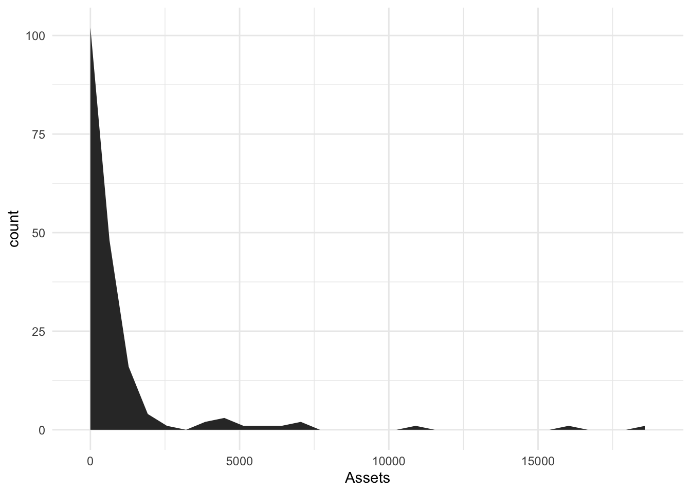
Small binwidth with a large number of bins
I will color in the area with magenta and clean up the theme.
Bonds %>%
    ggplot(., aes(x = Assets)) + geom_area(stat = "bin", bins = 100, fill = "magenta") +
    theme_minimal()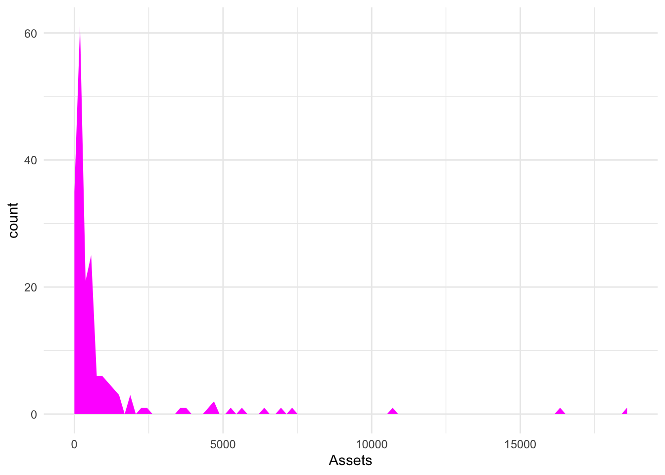
geom_density()
A relative of the histogram and the area plots above, the density plot smooths out the blocks of a histogram with a moving window [known as the bandwidth].
geom_density() outlines
Bonds %>%
    ggplot(., aes(x = Assets)) + geom_density(outline.type = "upper")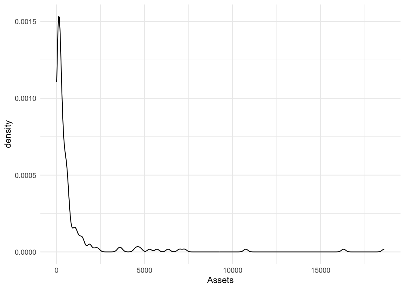
Bonds %>%
    ggplot(., aes(x = Assets)) + geom_density(outline.type = "lower")
Bonds %>%
    ggplot(., aes(x = Assets)) + geom_density(outline.type = "full")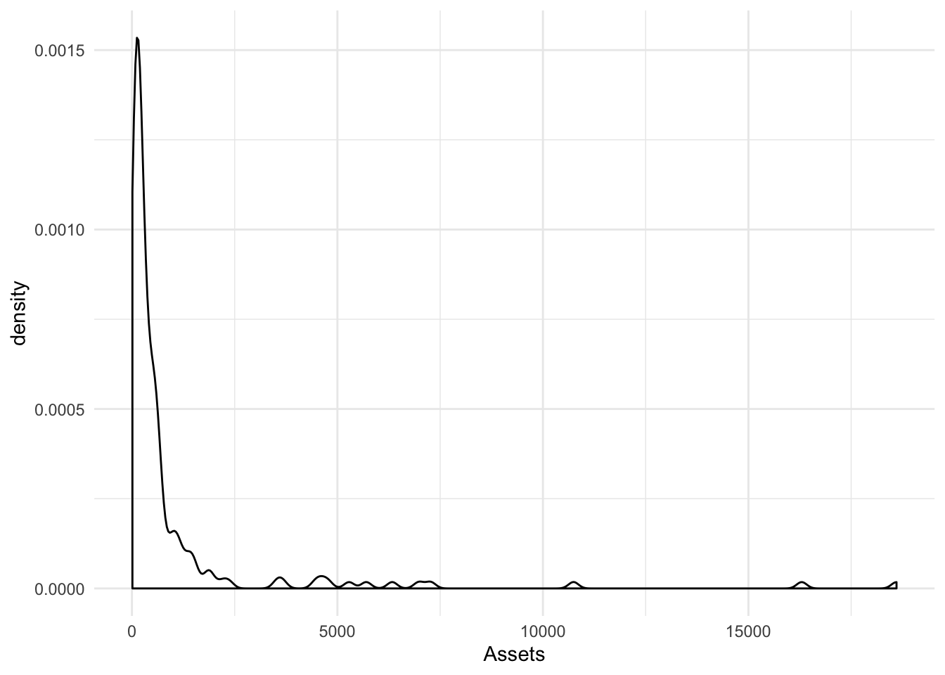
geom_density() adjust
Adjust applies a numeric correction to the bandwidth. Numbers greater than 1 make the bandwidth bigger [and the graphic smoother] and numbers less than 1 [but greater than zero] make the bandwidth smaller and the graphic more jagged.
Bonds %>%
    ggplot(., aes(x = Assets)) + geom_density(adjust = 2)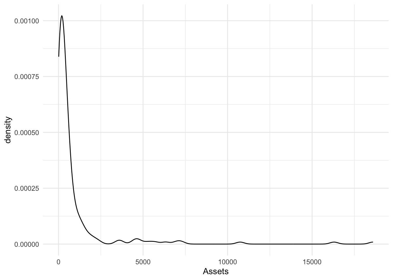
Bonds %>%
    ggplot(., aes(x = Assets)) + geom_density(adjust = 1/2)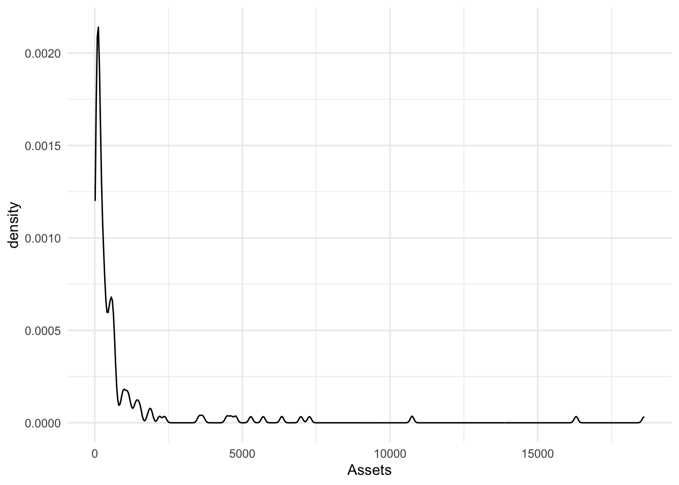
geom_boxplot
A boxplot shows a box of the first and third quartiles and a notch at the median. The dots above or below denote points outside the hinges. The hinges [default to 1.5*IQR] show a range of expected data while the individual dots show possible outliers outside the hinges. To adjust the hinges, the argument coef=1.5 can be adjusted.
Bonds %>%
    ggplot(., aes(x = Assets)) + geom_boxplot()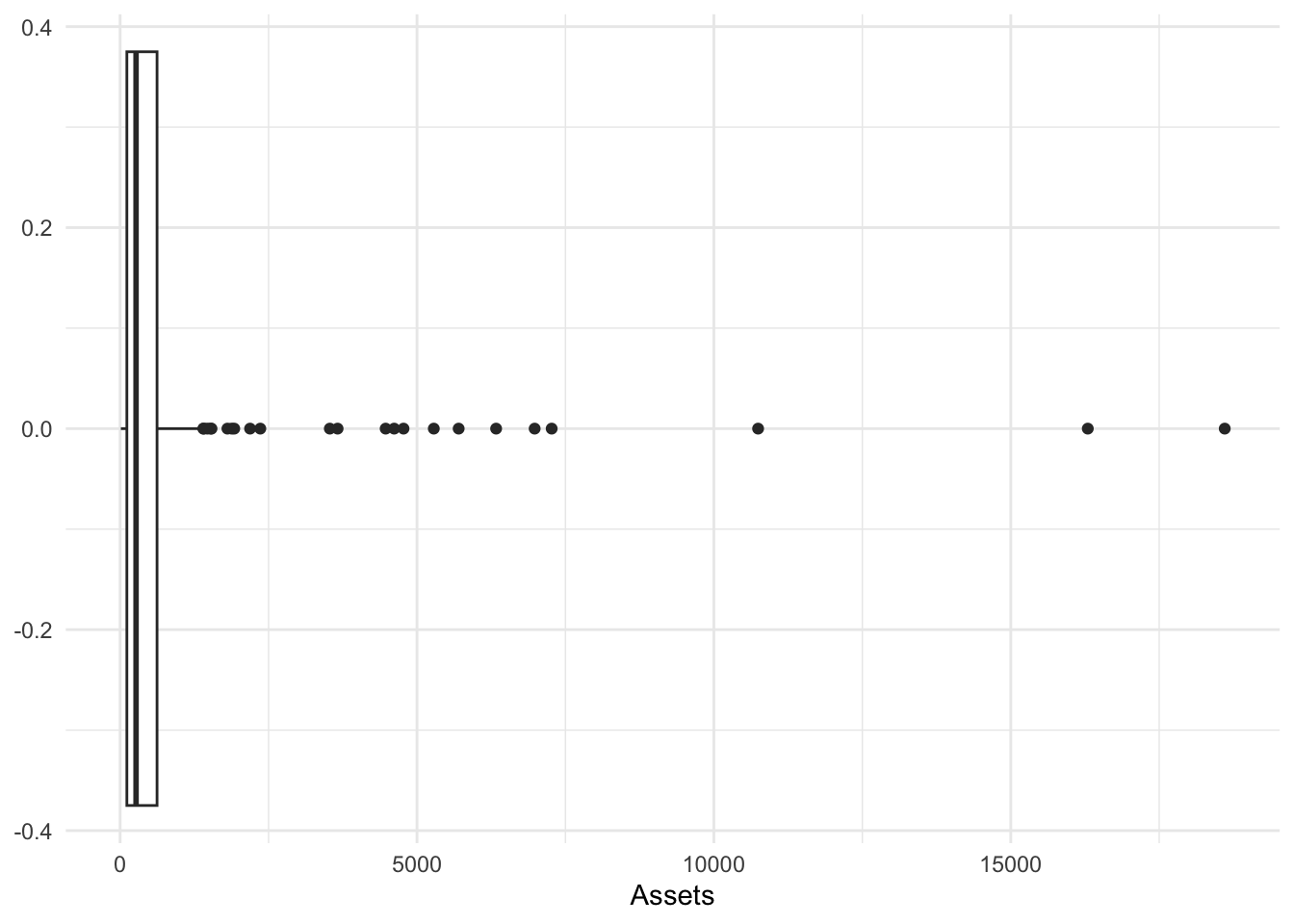
geom_qq()
To compare empirical and theoretical quantiles. Comparing a distribution to the normal or others is common and this provides the tool for doing so. The default is a normal.
The empirical cumulative distribution function arises when we sort a quantitative variable and show the percentiles below said value.
Bonds %>%
    ggplot(aes(sample = Assets)) + geom_qq()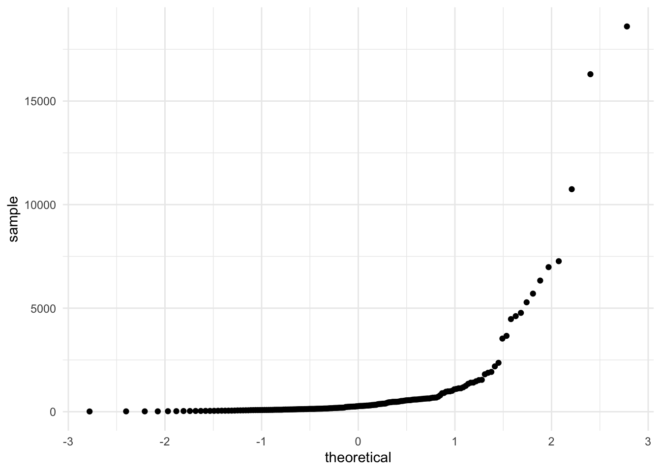
stat_ecdf(geom = )
We could do this with most geometries. I will show a few.
stat_ecdf(geom = "step")
Bonds %>%
    ggplot(aes(x = Assets)) + stat_ecdf(geom = "point") + stat_ecdf(geom = "step",
    alpha = 0.1) + labs(y = "ECDF: Proportion less than Assets") + theme_minimal()
stat_ecdf(geom = "point")
Bonds %>%
    ggplot(aes(x = Assets)) + stat_ecdf(geom = "point") + stat_ecdf(geom = "step",
    alpha = 0.1) + labs(y = "ECDF: Proportion less than Assets") + theme_minimal()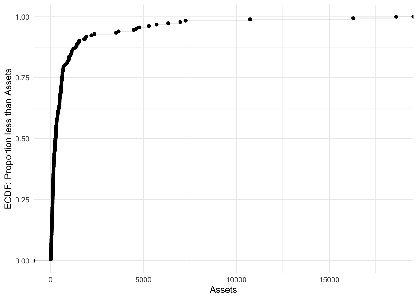
Combining two
Bonds %>%
    ggplot(aes(x = Assets)) + stat_ecdf(geom = "point") + stat_ecdf(geom = "step",
    alpha = 0.1) + labs(y = "ECDF: Proportion less than Assets") + theme_minimal()
stat_ecdf(geom = "line")
Bonds %>%
    ggplot(aes(x = Assets)) + stat_ecdf(geom = "line") + labs(y = "ECDF: Proportion less than Assets") +
    theme_minimal()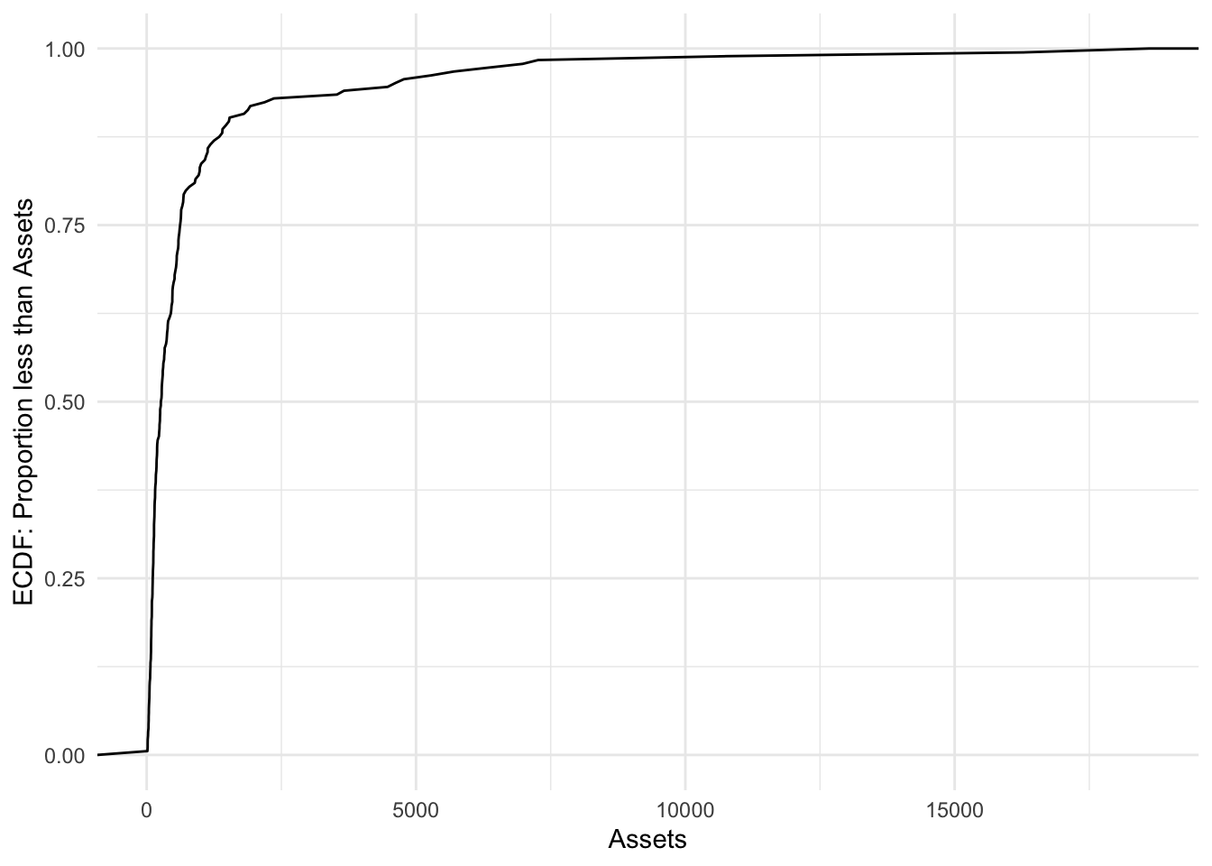
stat_ecdf(geom = "area")
Bonds %>%
    ggplot(aes(x = Assets)) + stat_ecdf(geom = "area", alpha = 0.2) + labs(y = "ECDF: Proportion less than Assets") +
    theme_minimal()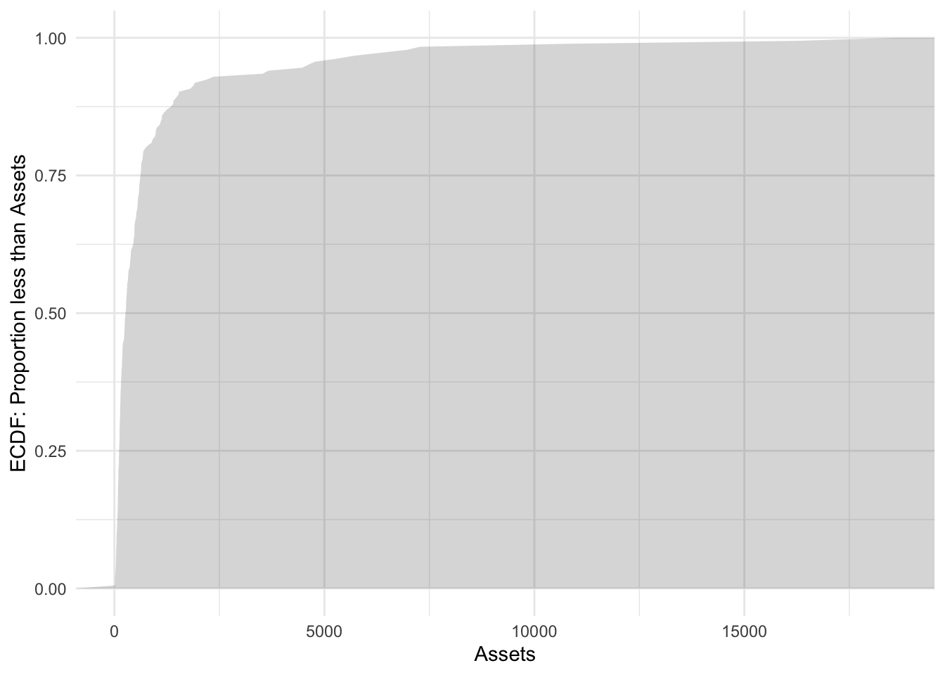
geom_boxplot()
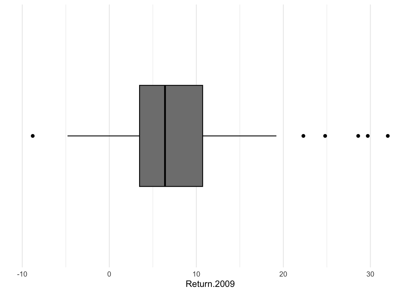
A boxplot is a method for visualizing the five-number summary that we deploy to summarise asymmetric quantitative data. The technical name is a box-and-whisker plot. The outer edges of the box provide visual representation of the first [\(25^{th}\) percentile] and third quartiles [\(75^{th}\) percentile]. The whiskers extend out, by default, to represent 1.5 times the interquartile range. Anything outside of the whiskers could be classified as an outlier, this definition originally owes, as far as I know, to John Tukey, and is often referred to as Tukey’s rule. If one wished to adjust this, the argument is coef=.
Bonds %>%
    ggplot() + aes(x = Return.2009) + geom_boxplot()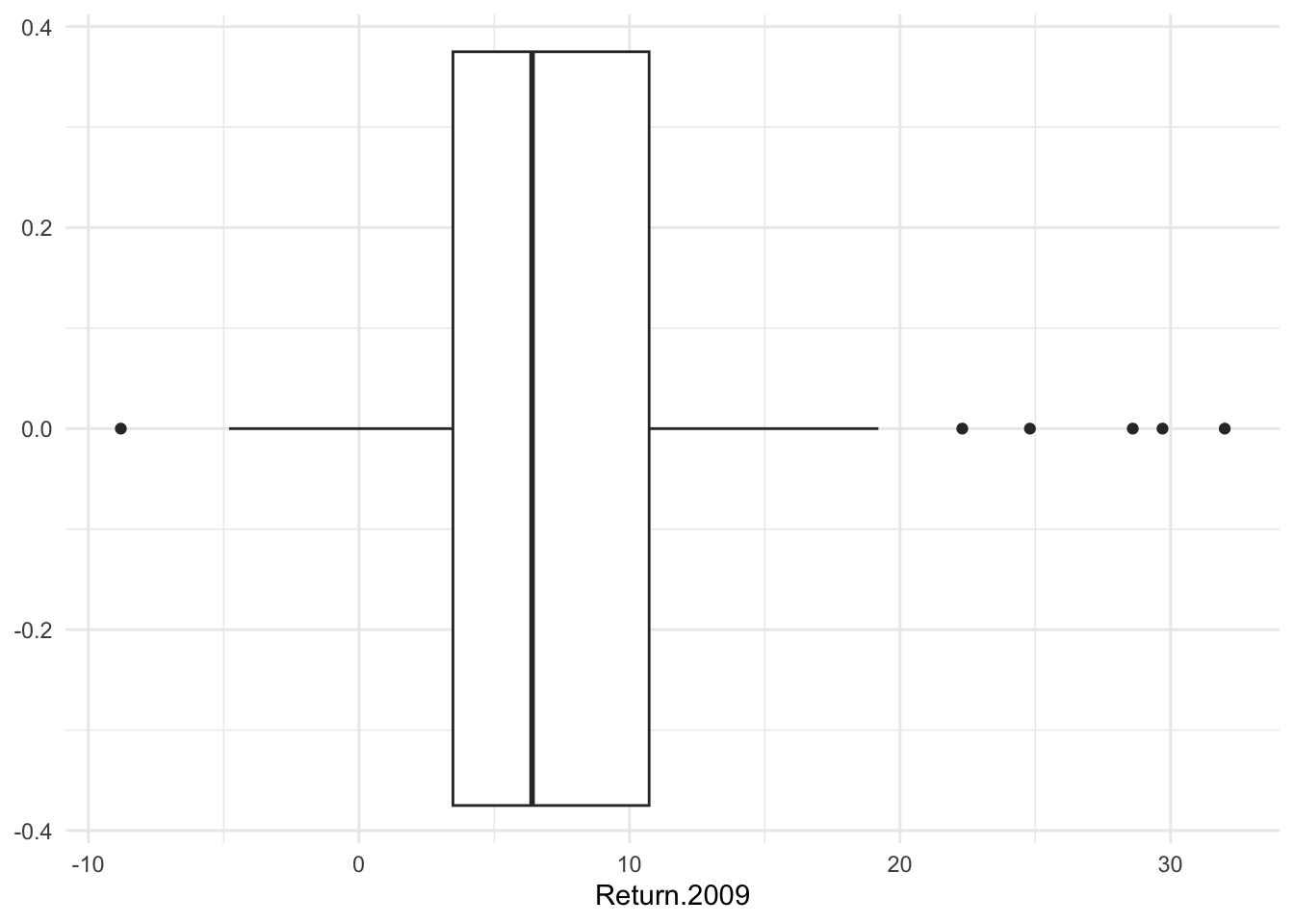
I do not like the default y-axis because it is completely meaningless. Some call this chart junk. To remove it, I will need to cancel the two key elements of the y-axis, the labels and the breaks. I will add a minimal theme.
Bonds %>%
    ggplot() + aes(x = Return.2009) + geom_boxplot() + scale_y_discrete(labels = NULL,
    breaks = NULL) + labs(y = "") + theme_minimal()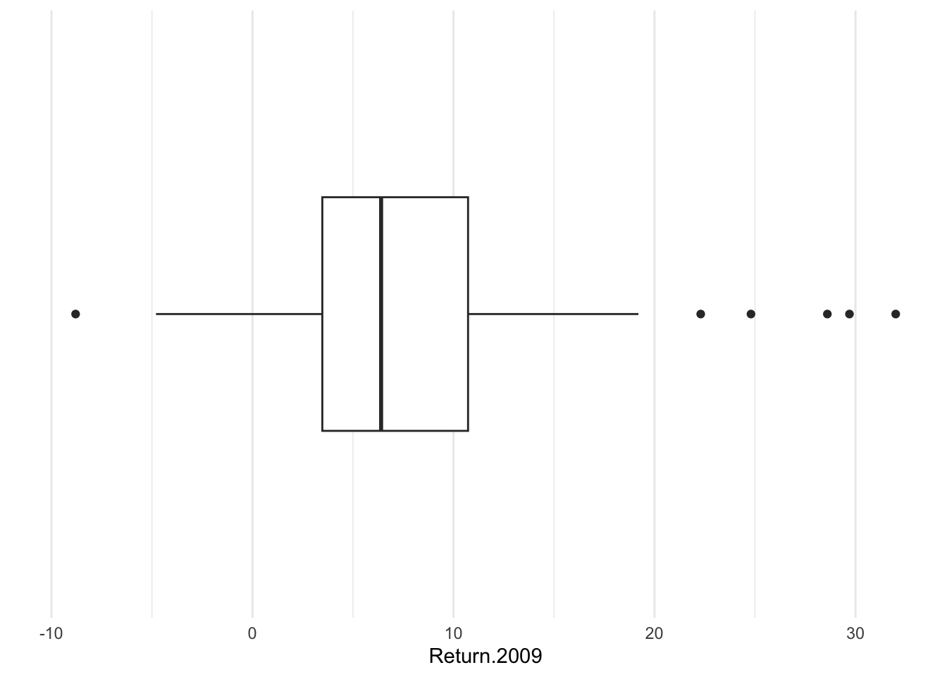
Though we often think about aesthetics as functions of data, they can be set to constant in cases that make sense. For example, suppose I want to color the lines of the boxplot; that’s color (rather than fill).
Bonds %>%
    ggplot() + aes(x = Return.2009) + geom_boxplot(color = "black", fill = "grey50") +
    scale_y_discrete(labels = NULL, breaks = NULL) + labs(y = "") + theme_minimal()