How’s that done?
library(tidyverse)
library(readxl)
library(janitor)
library(DT)
library(htmltools)
CPI22 <- readxl::read_excel(path="data/CPI2022_GlobalResultsTrends.xlsx", sheet=1, skip=2) %>% clean_names()
datatable(CPI22)Last updated: 2023-04-14 03:01:00
Timezone: America/Los_Angeles
Transparency International provides a wealth of interesting data; I want to work with their Corruption Perceptions Index. The data can be obtained in an Excel spreadsheet. Here’s a brief shot of the file. The main object of interest, throughout, is the cpi_score – the corruption perception index.

These data have a first two rows that will need to be skipped and the names are terrible but we can use janitor’s clean_names to take care of that. The other thing to notice is three sheets. The second sheet will need some tidying and the third sheet is not all that interesting, to me. Let’s import the first one.
library(tidyverse)
library(readxl)
library(janitor)
library(DT)
library(htmltools)
CPI22 <- readxl::read_excel(path="data/CPI2022_GlobalResultsTrends.xlsx", sheet=1, skip=2) %>% clean_names()
datatable(CPI22)We also have the time series data. Let’s first import them.
CPI.Time <- readxl::read_excel(path="data/CPI2022_GlobalResultsTrends.xlsx", sheet=2, skip=2) %>% clean_names()
datatable(CPI.Time)These data require some tidying with pivot_longer; we will want to grab a cpi_score, rank, sources, and standard_error for each year that we have data. It is worth noting that the ranks only go back to 2017. There are harder and easier ways to do this. I wrote a quick function to take two inputs and then pivot each of the four series separately.
cleaner <- function(data, string) {
# Start with the data
data %>%
# Use the iso3 as ID and keep everything that starts with string
select(iso3, starts_with(string)) %>%
# pivot those variables except iso3
pivot_longer(.,
cols=-iso3,
# names_prefix needs to remove string_
names_prefix = paste0(string,"_",sep=""),
# make what's left of the names the year -- it will be a four digit year
names_to = "year",
# make the values named string
values_to=string)
}
CPI.TS.Tidy <- cleaner(CPI.Time,"cpi_score")
Sources.TS.Tidy <- cleaner(CPI.Time,"sources")
StdErr.TS.Tidy <- cleaner(CPI.Time,"standard_error")
Rank.TS.Tidy <- cleaner(CPI.Time, "rank")Now I can join them back together.
Panel <- left_join(CPI.TS.Tidy, Sources.TS.Tidy) %>% left_join(., StdErr.TS.Tidy) %>% left_join(Rank.TS.Tidy) %>% mutate(year = as.integer(year))
rm(CPI.TS.Tidy, Sources.TS.Tidy, StdErr.TS.Tidy, Rank.TS.Tidy)The third sheet is a set of statistically significant changes that I do not so much care about.
library(skimr)
Panel %>% skim()| Name | Piped data |
| Number of rows | 1991 |
| Number of columns | 6 |
| _______________________ | |
| Column type frequency: | |
| character | 1 |
| numeric | 5 |
| ________________________ | |
| Group variables | None |
Variable type: character
| skim_variable | n_missing | complete_rate | min | max | empty | n_unique | whitespace |
|---|---|---|---|---|---|---|---|
| iso3 | 0 | 1 | 3 | 3 | 0 | 181 | 0 |
Variable type: numeric
| skim_variable | n_missing | complete_rate | mean | sd | p0 | p25 | p50 | p75 | p100 | hist |
|---|---|---|---|---|---|---|---|---|---|---|
| year | 0 | 1.00 | 2017.00 | 3.16 | 2012.00 | 2014.00 | 2017.00 | 2020.00 | 2022.00 | ▇▅▅▅▅ |
| cpi_score | 42 | 0.98 | 43.03 | 19.27 | 8.00 | 29.00 | 38.00 | 56.00 | 92.00 | ▃▇▅▂▂ |
| sources | 42 | 0.98 | 6.72 | 1.84 | 3.00 | 5.00 | 7.00 | 8.00 | 10.00 | ▃▂▇▅▃ |
| standard_error | 42 | 0.98 | 2.89 | 1.55 | 0.41 | 1.85 | 2.51 | 3.49 | 12.81 | ▇▅▁▁▁ |
| rank | 911 | 0.54 | 89.04 | 51.63 | 1.00 | 45.00 | 87.00 | 132.50 | 180.00 | ▇▇▇▇▇ |
library("rnaturalearth")
library("rnaturalearthdata")
world <- ne_countries(scale = "medium", returnclass = "sf")
# create world map using ggplot() function
ggplot(world) +
geom_sf(fill="pink", color="black", size=0.1, alpha=0.2) +
theme_void() +
labs(title="A Starting Point")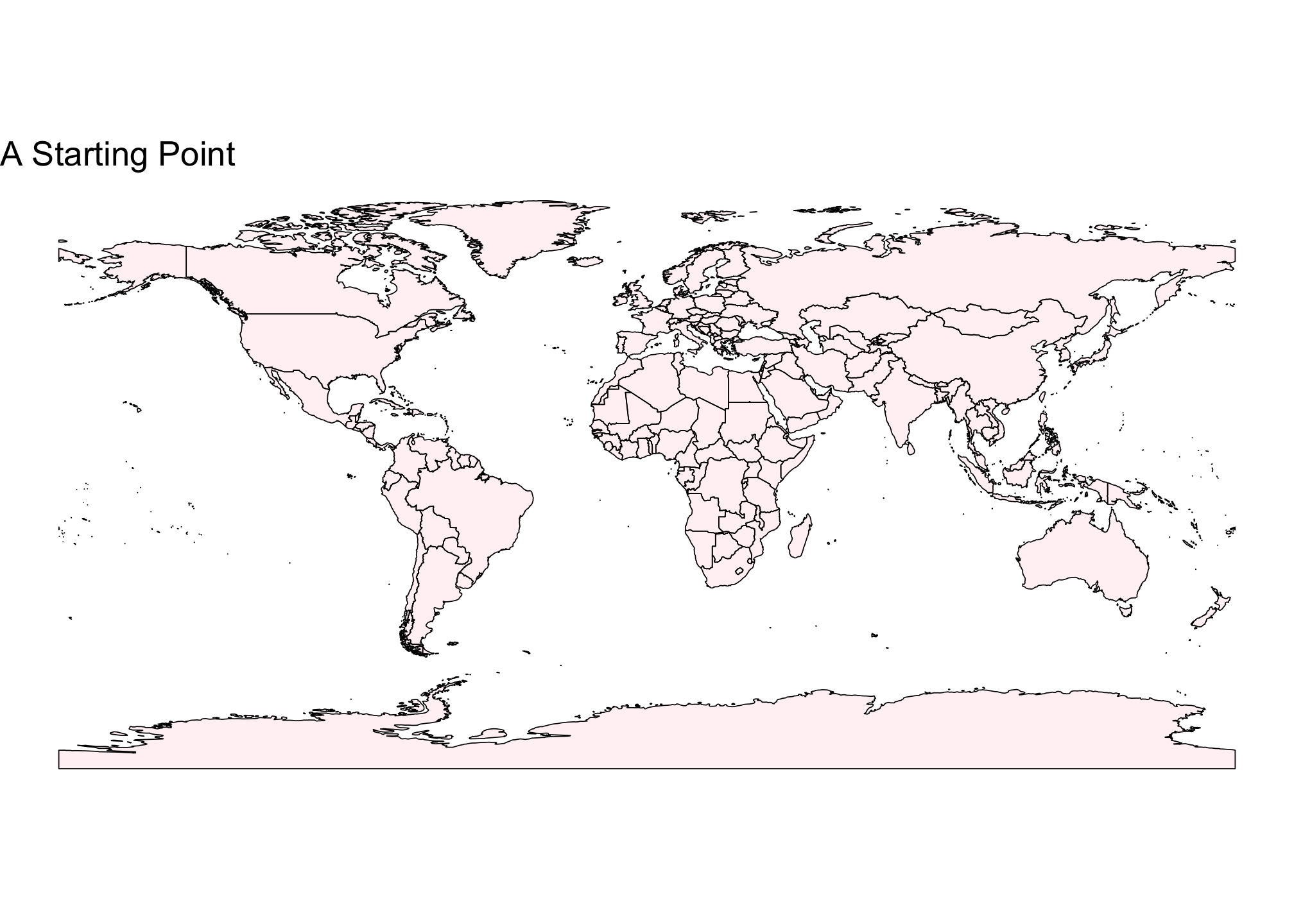
The sf package has special merge methods that I will deploy to combine the two bits of data.
Map.Data <- merge(world, Panel, by.x="iso_a3", by.y= "iso3")Now to draw a map.
# create world map using ggplot() function
Map.Data <- Map.Data %>% mutate(tooltip = paste0(sovereignt,"<br>",year,"<br>CPI: ",cpi_score, sep=""))
Map.Res <- Map.Data %>%
dplyr::filter(year==2022L) %>%
ggplot(.) +
geom_sf(aes(fill=cpi_score, text=tooltip), size=0.1, alpha=0.8) +
scale_fill_viridis_c() +
theme_void() +
labs(title="Perceived Corruption around the World in 2022",
caption="Data from Transparency International",
fill = "CPI") + theme(legend.position="bottom")
Map.Res
library(plotly)
ggplotly(Map.Res, tooltip = "text")ggplotly is neat but it has periodic bugs; in the end, it was much better to rewrite in the plotly interface, as you will see at the bottom.
I wanted to add in a table both to follow the assignment instructions and because I wanted to be able to look at some elements in a tabular comparison. It was also an excuse to learn a bit of reactable. This isn’t a very good example of what it will look like in the shiny because the filters will help keep the table of manageable size.
bar_chart <- function(label, width = "100%", height = "1rem", fill = "#00bfc4", background = NULL) {
bar <- div(style = list(background = fill, width = width, height = height))
chart <- div(style = list(flexGrow = 1, marginLeft = "0.5rem", background = background), bar)
div(style = list(display = "flex", alignItems = "center"), label, chart)
}
orange_pal <- function(x) rgb(colorRamp(c("#ffe4cc", "#ffb54d"))(x), maxColorValue = 255)
library(reactable)
Map.Data |> filter(year == 2020) |> reactable(
groupBy = "region_un",
defaultColDef = colDef(show = F),
columns = list(
country_territory = colDef(show=T,
name = "Country Name"),
year = colDef(show=T, name = "Year"),
region_un = colDef(show=T, name = "Region"),
CPI = colDef(show=T, name="Corruption Perception Index"),
Rank = colDef(show=T,
style = function(value) {
normalized <- scale(value, scale=FALSE)
color <- orange_pal(value/181)
list(background = color, color = "black")
}
),
standard_error = colDef(show=T,
name = "Standard Deviation of CPI"),
sources = colDef(show=T,
name = "No. of Sources",
align = "left",
cell = function(value) {
width <- paste0(value*10,"%")
bar_chart(value, width = width)
})
),
theme = reactableTheme(
color = "hsl(233, 9%, 87%)",
backgroundColor = "hsl(233, 9%, 19%)",
borderColor = "hsl(233, 9%, 22%)",
stripedColor = "hsl(233, 12%, 22%)",
highlightColor = "hsl(233, 12%, 24%)",
inputStyle = list(backgroundColor = "hsl(233, 9%, 25%)"),
selectStyle = list(backgroundColor = "hsl(233, 9%, 25%)"),
pageButtonHoverStyle = list(backgroundColor = "hsl(233, 9%, 25%)"),
pageButtonActiveStyle = list(backgroundColor = "hsl(233, 9%, 28%)")
)
)library(shiny)
library(dplyr)
library(tidyr)
library(readxl)
library(janitor)
library(reactable)
library(plotly)
library(viridis)
library(shinythemes)
library(htmltools)
# Load the multiperiod data
CPI.Time <- readxl::read_excel(path="data/CPI2022_GlobalResultsTrends.xlsx", sheet=2, skip=2) %>% clean_names()
# create a cleaner function to clean the data
cleaner <- function(data, string) {
# Start with the data
data |>
# Use the iso3 as ID and keep everything that starts with string
select(iso3, starts_with(string)) |>
# pivot those variables except iso3
pivot_longer(cols=-iso3,
# names_prefix needs to remove string_
names_prefix = paste0(string,"_",sep=""),
# make what's left of the names the year -- it will be a four digit year
names_to = "year",
# make the values named string
values_to=string)
}
# Clean the panel data
CPI.TS.Tidy <- cleaner(CPI.Time,"cpi_score")
Sources.TS.Tidy <- cleaner(CPI.Time,"sources")
StdErr.TS.Tidy <- cleaner(CPI.Time,"standard_error")
Rank.TS.Tidy <- cleaner(CPI.Time, "rank")
# Join together the panel data
Panel.FJ <- left_join(CPI.TS.Tidy, Sources.TS.Tidy) |>
left_join(StdErr.TS.Tidy) |>
left_join(Rank.TS.Tidy) |>
mutate(year = as.integer(year)) |>
filter(year > 2016)
rm(CPI.TS.Tidy, Sources.TS.Tidy, StdErr.TS.Tidy, Rank.TS.Tidy)
# Map Stuff
library("rnaturalearth")
library("rnaturalearthdata")
world <- ne_countries(scale = "medium", returnclass = "sf")
# Join the data to the map
Names.Merge <- CPI.Time |> select(iso3, country_territory, region)
Panel <- left_join(Panel.FJ, Names.Merge) |>
relocate(where(is.character)) # |>
Map.Data <- merge(world, Panel, by.x="iso_a3", by.y= "iso3")
Map.Data <- Map.Data |>
mutate(tooltip = paste0(sovereignt,"<br>",year,"<br>CPI: ",cpi_score, "<br>Rank: ",rank, sep="")) |>
rename(Rank = rank) |>
rename(CPI = cpi_score) |>
group_by(region_un, year) |>
mutate(sCPI = scale(CPI, scale = FALSE)) |>
ungroup() |>
mutate(standard_error = round(standard_error, 3)) |>
select(iso_a3, country_territory, year, region_un, CPI, sCPI, Rank, standard_error, sources, tooltip, geometry)
rm(Panel.FJ, Names.Merge)
Map.Data <- na.omit(Map.Data)
bar_chart_pos_neg <- function(label, value, max_value = 50, height = "1rem",
pos_fill = "green", neg_fill = "red") {
neg_chart <- div(style = list(flex = "1 1 0"))
pos_chart <- div(style = list(flex = "1 1 0"))
width <- paste0(abs(value / max_value) * 100, "%")
if (value < 0) {
bar <- div(style = list(marginLeft = "0.5rem", background = neg_fill, width = width, height = height))
chart <- div(
style = list(display = "flex", alignItems = "center", justifyContent = "flex-end"),
label,
bar
)
neg_chart <- tagAppendChild(neg_chart, chart)
} else {
bar <- div(style = list(marginRight = "0.5rem", background = pos_fill, width = width, height = height))
chart <- div(style = list(display = "flex", alignItems = "center"), bar, label)
pos_chart <- tagAppendChild(pos_chart, chart)
}
div(style = list(display = "flex"), neg_chart, pos_chart)
}
bar_chart <- function(label, width = "100%", height = "1rem", fill = "#00bfc4", background = NULL) {
bar <- div(style = list(background = fill, width = width, height = height))
chart <- div(style = list(flexGrow = 1, marginLeft = "0.5rem", background = background), bar)
div(style = list(display = "flex", alignItems = "center"), label, chart)
}
orange_pal <- function(x) rgb(colorRamp(c("#ffe4cc", "#ffb54d"))(x), maxColorValue = 255)
# Define UI for application
ui <- fluidPage(theme=shinytheme("darkly"),
tabsetPanel(
tabPanel("Plotly",
plotlyOutput("distPlot", height="650px")
),
tabPanel("Data",
reactableOutput("DT")
)),
# Sidebar with a slider input for number of bins
fluidRow(
column(width=4,
radioButtons("pal",
"Viridis Palette:",
choices = c(LETTERS[1:5]),
selected = "D",
inline = TRUE
)),
column(width=4,
selectInput("var",
"Variable",
choices = list("Corruption Index" = "CPI",
"Rank" = "Rank",
"No. of Sources" = "sources",
"Std. Error" = "standard_error"),
selected = "CPI"),
print(
HTML("<small>Corruption Index: Corruption Perceptions Index (CPI) <br/>
Rank: Ranking, Best to Worst <br/>
No. of Sources: Number of Sources for CPI <br/>
Std. Error: Variability of CPI</small>"))),
column(width=4,
sliderInput("year",
"Year",
min = 2017,
max= 2022,
value = 2022)
)
)
)
server <- function(input, output, session) {
Map.Me <- reactive({Map.Data |> filter(year==input$year)})
output$DT <- renderReactable(
reactable(Map.Me(),
groupBy = "region_un",
defaultColDef = colDef(show = F),
columns = list(
country_territory = colDef(show=T,
name = "Country Name"),
year = colDef(show=T, name = "Year"),
region_un = colDef(show=T, name = "Region"),
CPI = colDef(show=T, name="Corruption Perception Index"),
sCPI = colDef(show=T,
name = "Scaled Corruption",
cell = function(value) {
label <- paste(round(value, digits=2))
bar_chart_pos_neg(label, value)
}),
Rank = colDef(show=T,
style = function(value) {
normalized <- scale(value, scale=FALSE)
color <- orange_pal(value/181)
list(background = color, color = "black")
}
),
standard_error = colDef(show=T,
name = "Standard Deviation of CPI"),
sources = colDef(show=T,
name = "No. of Sources",
align = "left",
cell = function(value) {
width <- paste0(value*10,"%")
bar_chart(value, width = width)
})
),
theme = reactableTheme(
color = "hsl(233, 9%, 87%)",
backgroundColor = "hsl(233, 9%, 19%)",
borderColor = "hsl(233, 9%, 22%)",
stripedColor = "hsl(233, 12%, 22%)",
highlightColor = "hsl(233, 12%, 24%)",
inputStyle = list(backgroundColor = "hsl(233, 9%, 25%)"),
selectStyle = list(backgroundColor = "hsl(233, 9%, 25%)"),
pageButtonHoverStyle = list(backgroundColor = "hsl(233, 9%, 25%)"),
pageButtonActiveStyle = list(backgroundColor = "hsl(233, 9%, 28%)")
)
)
)
output$distPlot <- renderPlotly({
plot_geo(Map.Me(),
hovertext=~tooltip) |>
add_trace(
z = ~get(input$var),
locations = ~iso_a3,
color = ~get(input$var),
colors = viridis_pal(option = input$pal)(3)
) |>
layout(
geo = list(showframe=FALSE)) |>
colorbar(title = paste(input$var, "in", input$year))
})
}
# Run the application
shinyApp(ui = ui, server = server)knitr::write_bib(names(sessionInfo()$otherPkgs), file="bibliography.bib")