This document contains the complete analytical workflow generated during our session, formatted for use in Quarto.
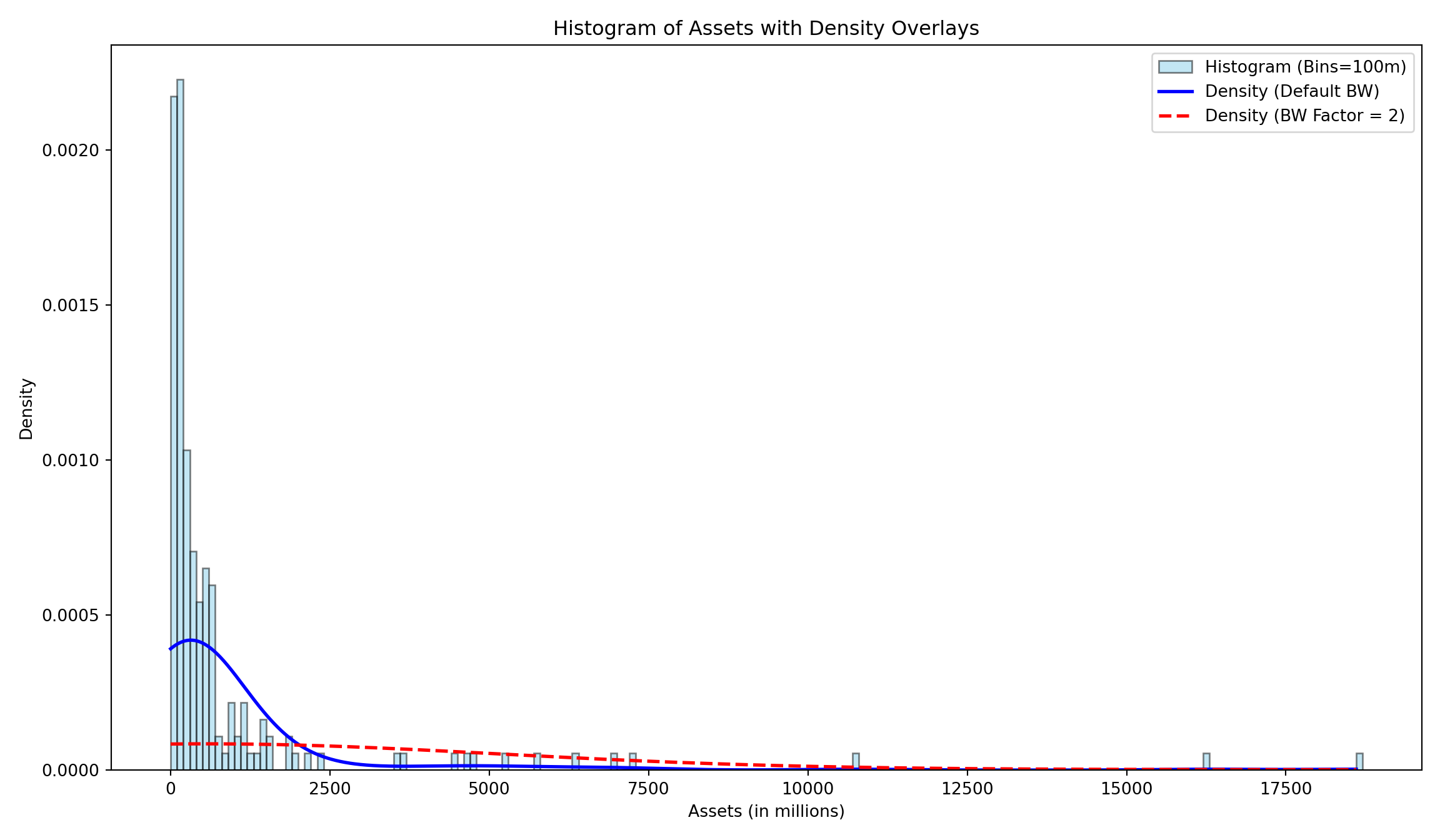
1. Initial Exploration: Asset Distribution
We began by examining the distribution of assets across the funds using a histogram with density overlays.
How’s that done?
import pandas as pdimport matplotlib.pyplot as pltimport numpy as npfrom scipy.stats import gaussian_kde# Load the datasetdf = pd.read_csv('./BondFunds.csv')assets = df['Assets'].dropna()# Define bin parametersbin_size =100bins = np.arange(0, assets.max() + bin_size, bin_size)# Create the plotplt.figure(figsize=(12, 7))# 1. Histogramplt.hist(assets, bins=bins, density=True, color='skyblue', edgecolor='black', alpha=0.5, label='Histogram (Bins=100m)')# Generate points for the KDE linesx_eval = np.linspace(0, assets.max(), 1000)# 2. Density with Default Bandwidthkde_default = gaussian_kde(assets)plt.plot(x_eval, kde_default(x_eval), color='blue', lw=2, label='Density (Default BW)')# 3. Density with Bandwidth = 2kde_bw2 = gaussian_kde(assets, bw_method=2.0)plt.plot(x_eval, kde_bw2(x_eval), color='red', lw=2, linestyle='--', label='Density (BW Factor = 2)')plt.title('Histogram of Assets with Density Overlays')plt.xlabel('Assets (in millions)')plt.ylabel('Density')plt.legend()plt.tight_layout()plt.show()
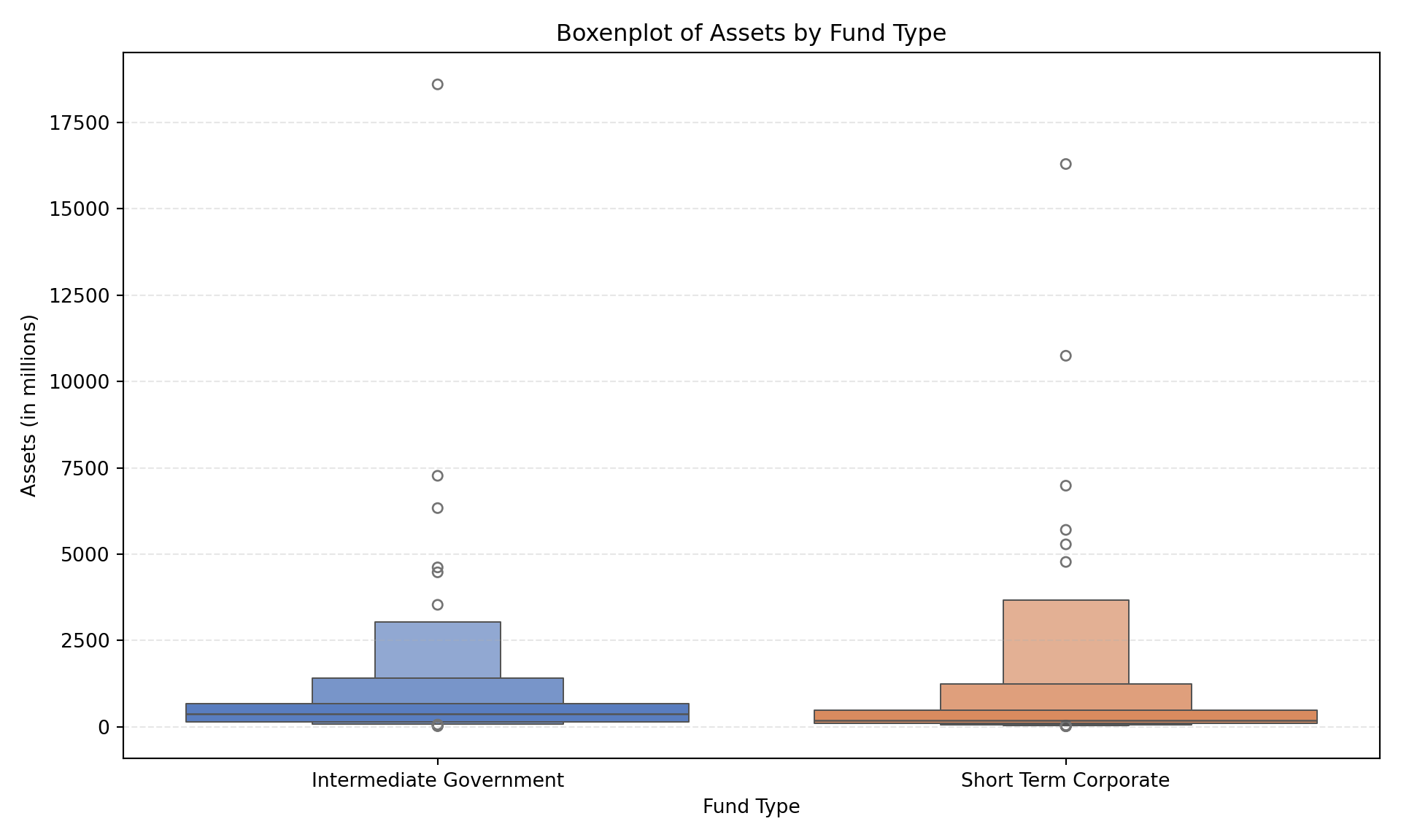
2. Advanced Distribution Visualization: Boxenplots
To visualize the distribution of assets by fund type, specifically focusing on tail behavior, we used boxenplots.
2.1 Standard Scale
How’s that done?
import seaborn as snsplt.figure(figsize=(10, 6))sns.boxenplot(x='Type', y='Assets', data=df, palette='muted')plt.title('Boxenplot of Assets by Fund Type')plt.xlabel('Fund Type')plt.ylabel('Assets (in millions)')plt.grid(axis='y', linestyle='--', alpha=0.3)plt.tight_layout()plt.show()
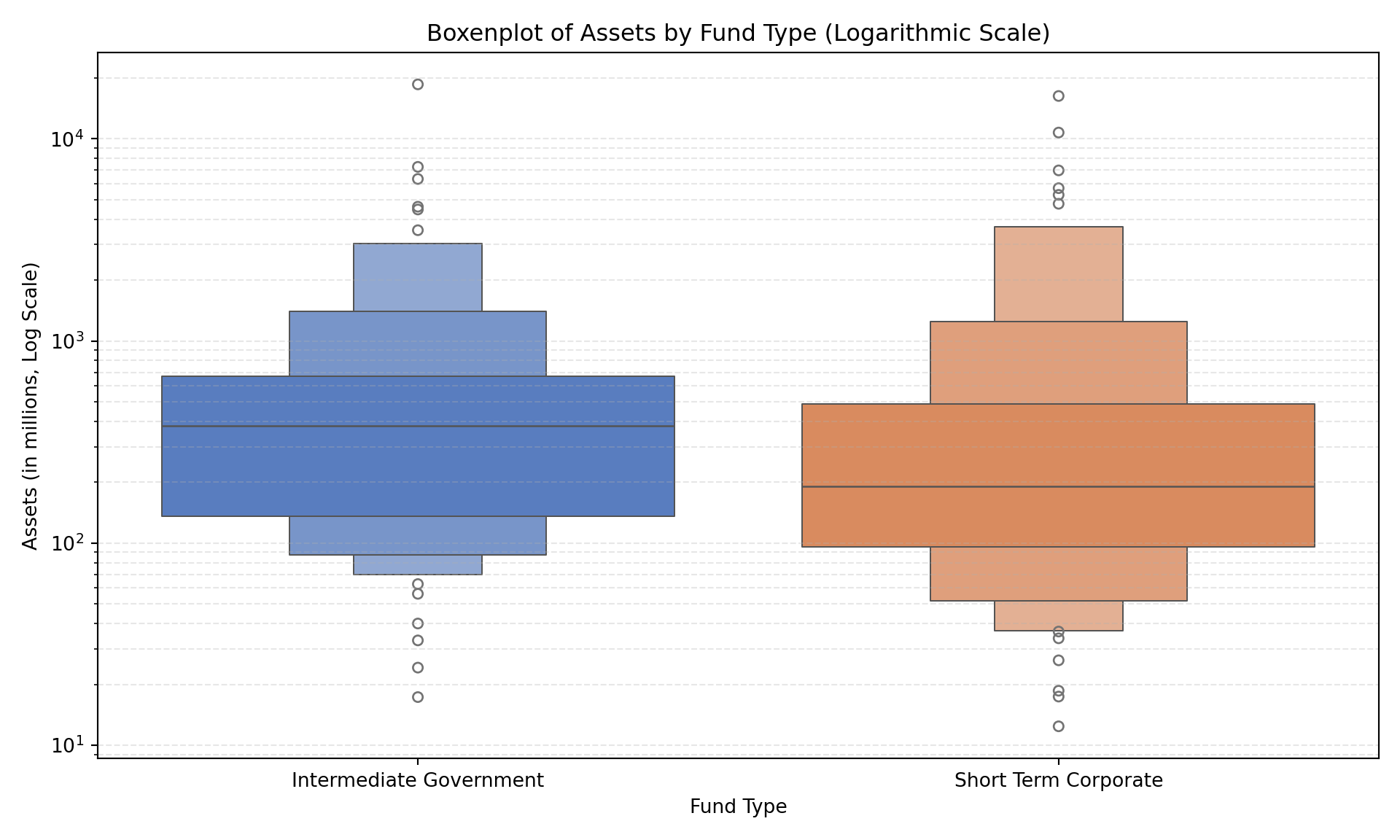
2.2 Logarithmic Scale
Recognizing the skew in the data, we reconstructed the boxenplot on a logarithmic scale.
<string>:1: FutureWarning:

Passing `palette` without assigning `hue` is deprecated and will be removed in v0.14.0. Assign the `x` variable to `hue` and set `legend=False` for the same effect.
How’s that done?
ax.set_yscale("log")plt.title('Boxenplot of Assets by Fund Type (Logarithmic Scale)')plt.xlabel('Fund Type')plt.ylabel('Assets (in millions, Log Scale)')plt.grid(axis='y', which='both', linestyle='--', alpha=0.3)plt.tight_layout()plt.show()
3. Performance Analysis: 2009 Returns
We then shifted focus to the returns in 2009.
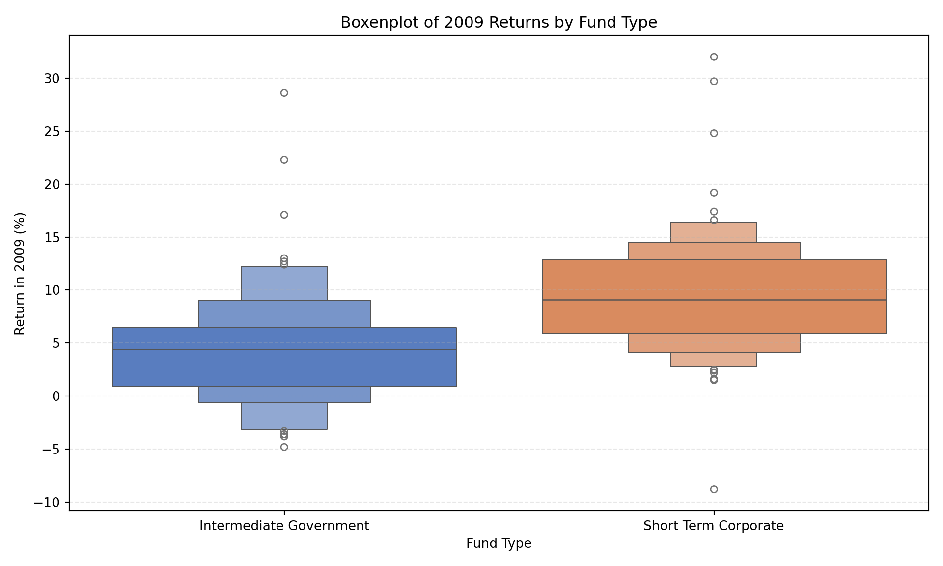
3.1 Boxenplot of Returns by Type
How’s that done?
plt.figure(figsize=(10, 6))sns.boxenplot(x='Type', y='Return 2009', data=df, palette='muted')plt.title('Boxenplot of 2009 Returns by Fund Type')plt.xlabel('Fund Type')plt.ylabel('Return in 2009 (%)')plt.grid(axis='y', linestyle='--', alpha=0.3)plt.tight_layout()plt.show()
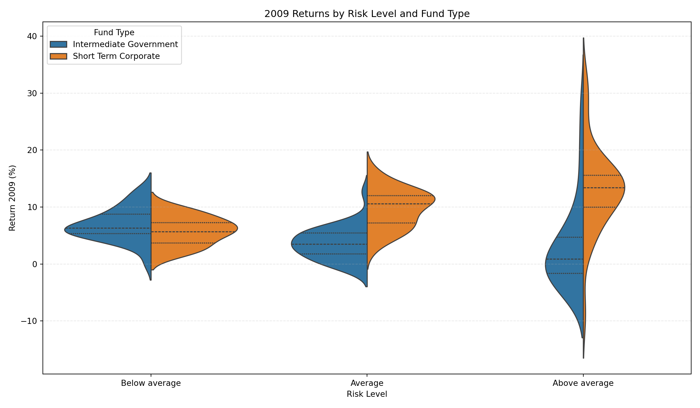
3.2 Violin Plot by Risk and Type
We introduced Risk into the analysis, visualizing returns with split violin plots.
How’s that done?
# Define categorical order for Riskrisk_order = ['Below average', 'Average', 'Above average']# Ensure Risk column is categorical with orderif'Risk'in df.columns: unique_risks = df['Risk'].unique()# Filter risk_order to only include present categories present_risks = [r for r in risk_order if r in unique_risks]# Add any missing risks to the end if necessary, or just use present_risks# This logic handles potential data mismatch df['Risk'] = pd.Categorical(df['Risk'], categories=risk_order, ordered=True)plt.figure(figsize=(12, 7))sns.violinplot(data=df, x='Risk', y='Return 2009', hue='Type', split=True, inner="quart")plt.title('2009 Returns by Risk Level and Fund Type')plt.xlabel('Risk Level')plt.ylabel('Return 2009 (%)')plt.legend(title='Fund Type')plt.grid(axis='y', linestyle='--', alpha=0.3)plt.tight_layout()plt.show()
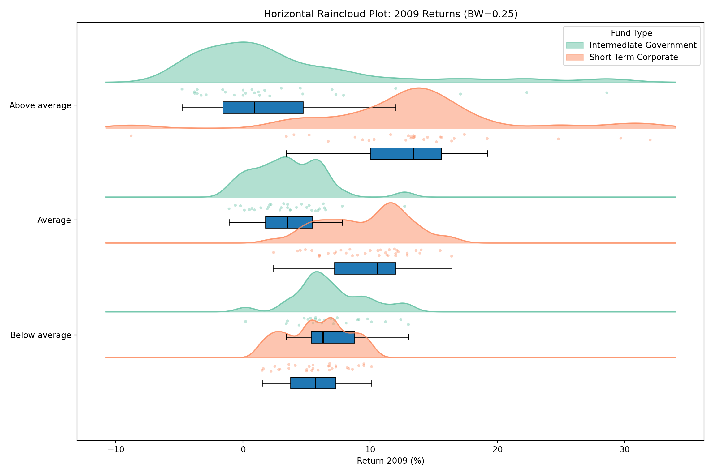
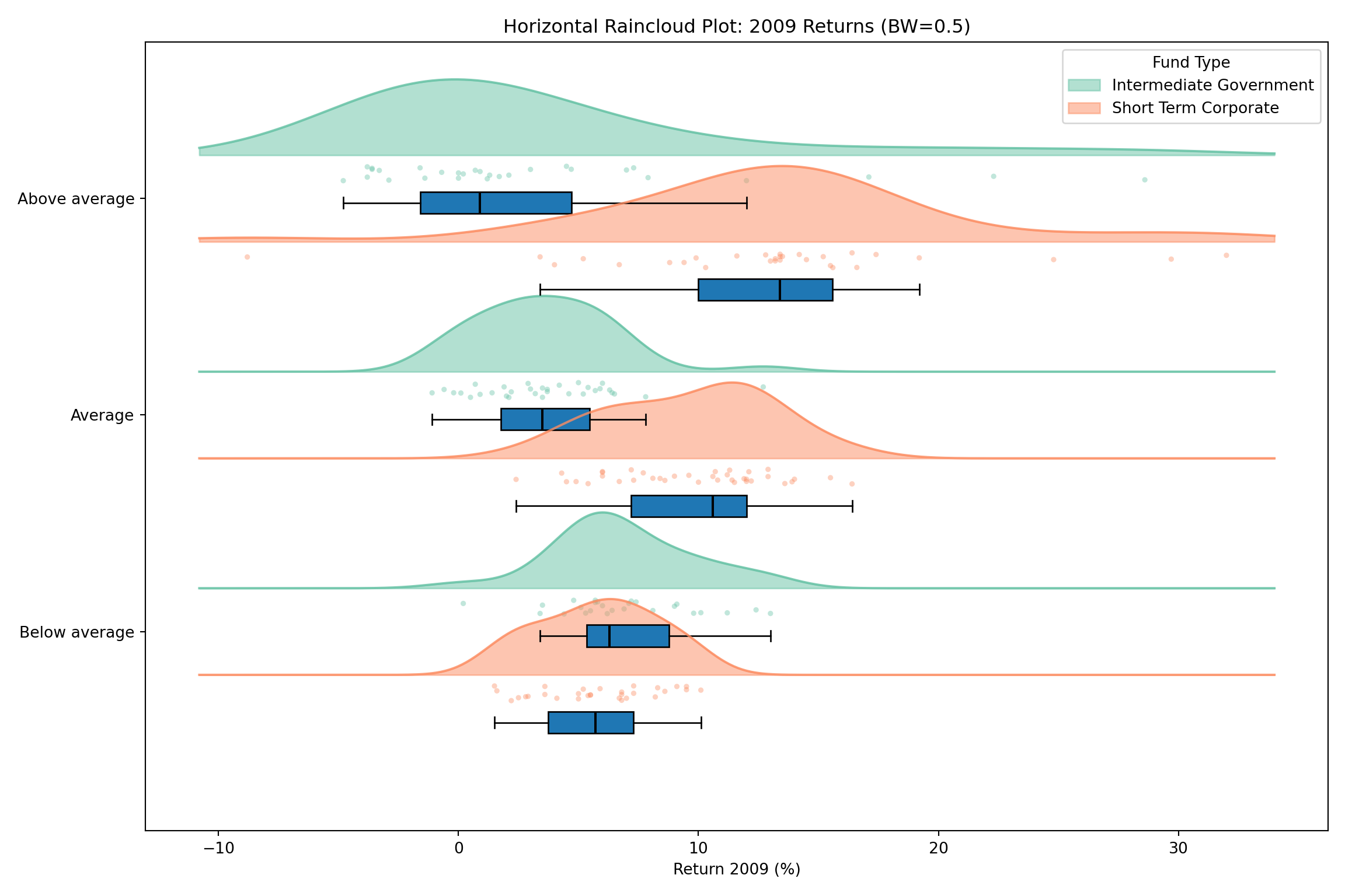
4. Horizontal Raincloud Plots
We refined the visualization into “Raincloud” plots to show density, raw data, and summary statistics simultaneously, oriented horizontally.
<matplotlib.collections.FillBetweenPolyCollection object at 0x12a8882d0>
[<matplotlib.lines.Line2D object at 0x12a7e67b0>]
<matplotlib.collections.PathCollection object at 0x12a888410>
{'whiskers': [<matplotlib.lines.Line2D object at 0x12a7e6a50>, <matplotlib.lines.Line2D object at 0x12a7e6ba0>], 'caps': [<matplotlib.lines.Line2D object at 0x12a7e6cf0>, <matplotlib.lines.Line2D object at 0x12a7e6e40>], 'boxes': [<matplotlib.patches.PathPatch object at 0x12a7e6510>], 'medians': [<matplotlib.lines.Line2D object at 0x12a7e6f90>], 'fliers': [], 'means': []}
<matplotlib.collections.FillBetweenPolyCollection object at 0x12a888550>
[<matplotlib.lines.Line2D object at 0x12a7e7380>]
<matplotlib.collections.PathCollection object at 0x12a888690>
{'whiskers': [<matplotlib.lines.Line2D object at 0x12a7e74d0>, <matplotlib.lines.Line2D object at 0x12a7e7620>], 'caps': [<matplotlib.lines.Line2D object at 0x12a7e7770>, <matplotlib.lines.Line2D object at 0x12a7e78c0>], 'boxes': [<matplotlib.patches.PathPatch object at 0x12a888910>], 'medians': [<matplotlib.lines.Line2D object at 0x12a7e7a10>], 'fliers': [], 'means': []}
<matplotlib.collections.FillBetweenPolyCollection object at 0x12a8887d0>
[<matplotlib.lines.Line2D object at 0x12a7e7b60>]
<matplotlib.collections.PathCollection object at 0x12a888a50>
{'whiskers': [<matplotlib.lines.Line2D object at 0x12a68c440>, <matplotlib.lines.Line2D object at 0x12a68c590>], 'caps': [<matplotlib.lines.Line2D object at 0x12a68c1a0>, <matplotlib.lines.Line2D object at 0x12a68c050>], 'boxes': [<matplotlib.patches.PathPatch object at 0x12a888cd0>], 'medians': [<matplotlib.lines.Line2D object at 0x12a43be00>], 'fliers': [], 'means': []}
<matplotlib.collections.FillBetweenPolyCollection object at 0x12a76e0d0>
[<matplotlib.lines.Line2D object at 0x12a43ba10>]
<matplotlib.collections.PathCollection object at 0x12a76df90>
{'whiskers': [<matplotlib.lines.Line2D object at 0x12a43bb60>, <matplotlib.lines.Line2D object at 0x12a43bcb0>], 'caps': [<matplotlib.lines.Line2D object at 0x12a43b8c0>, <matplotlib.lines.Line2D object at 0x12a43b770>], 'boxes': [<matplotlib.patches.PathPatch object at 0x12a76d590>], 'medians': [<matplotlib.lines.Line2D object at 0x12a43b620>], 'fliers': [], 'means': []}
<matplotlib.collections.FillBetweenPolyCollection object at 0x12a76dd10>
[<matplotlib.lines.Line2D object at 0x12a43b4d0>]
<matplotlib.collections.PathCollection object at 0x12a76d310>
{'whiskers': [<matplotlib.lines.Line2D object at 0x128d68ad0>, <matplotlib.lines.Line2D object at 0x129fd92b0>], 'caps': [<matplotlib.lines.Line2D object at 0x129fd9400>, <matplotlib.lines.Line2D object at 0x129b2cd70>], 'boxes': [<matplotlib.patches.PathPatch object at 0x12a76de50>], 'medians': [<matplotlib.lines.Line2D object at 0x129b2d010>], 'fliers': [], 'means': []}
<matplotlib.collections.FillBetweenPolyCollection object at 0x12a76d450>
[<matplotlib.lines.Line2D object at 0x129b2d160>]
<matplotlib.collections.PathCollection object at 0x12a76d6d0>
{'whiskers': [<matplotlib.lines.Line2D object at 0x129b2d400>, <matplotlib.lines.Line2D object at 0x12a7e70e0>], 'caps': [<matplotlib.lines.Line2D object at 0x12a7e7230>, <matplotlib.lines.Line2D object at 0x12a7e7cb0>], 'boxes': [<matplotlib.patches.PathPatch object at 0x12a76dbd0>], 'medians': [<matplotlib.lines.Line2D object at 0x12a7e7e00>], 'fliers': [], 'means': []}
How’s that done?
ax.set_yticks([i - (type_offset/2) for i inrange(len(risk_order))])ax.set_yticklabels(risk_order)ax.set_xlabel('Return 2009 (%)')ax.set_title('Horizontal Raincloud Plot: 2009 Returns (BW=0.5)')ax.legend(title="Fund Type", loc='upper right')plt.tight_layout()plt.show()
<matplotlib.collections.FillBetweenPolyCollection object at 0x12a889810>
[<matplotlib.lines.Line2D object at 0x12a862e40>]
<matplotlib.collections.PathCollection object at 0x12a889590>
{'whiskers': [<matplotlib.lines.Line2D object at 0x12a862f90>, <matplotlib.lines.Line2D object at 0x12a8630e0>], 'caps': [<matplotlib.lines.Line2D object at 0x12a863230>, <matplotlib.lines.Line2D object at 0x12a863380>], 'boxes': [<matplotlib.patches.PathPatch object at 0x12a889a90>], 'medians': [<matplotlib.lines.Line2D object at 0x12a8634d0>], 'fliers': [], 'means': []}
<matplotlib.collections.FillBetweenPolyCollection object at 0x12a889950>
[<matplotlib.lines.Line2D object at 0x12a863620>]
<matplotlib.collections.PathCollection object at 0x12a889e50>
{'whiskers': [<matplotlib.lines.Line2D object at 0x12a863770>, <matplotlib.lines.Line2D object at 0x12a8638c0>], 'caps': [<matplotlib.lines.Line2D object at 0x12a863a10>, <matplotlib.lines.Line2D object at 0x12a863b60>], 'boxes': [<matplotlib.patches.PathPatch object at 0x12a88a0d0>], 'medians': [<matplotlib.lines.Line2D object at 0x12a863cb0>], 'fliers': [], 'means': []}
<matplotlib.collections.FillBetweenPolyCollection object at 0x12a889f90>
[<matplotlib.lines.Line2D object at 0x12a863e00>]
<matplotlib.collections.PathCollection object at 0x12a88a210>
{'whiskers': [<matplotlib.lines.Line2D object at 0x12a694050>, <matplotlib.lines.Line2D object at 0x12a6941a0>], 'caps': [<matplotlib.lines.Line2D object at 0x12a6942f0>, <matplotlib.lines.Line2D object at 0x12a694440>], 'boxes': [<matplotlib.patches.PathPatch object at 0x12a88a490>], 'medians': [<matplotlib.lines.Line2D object at 0x12a694590>], 'fliers': [], 'means': []}
<matplotlib.collections.FillBetweenPolyCollection object at 0x12a88a350>
[<matplotlib.lines.Line2D object at 0x12a6946e0>]
<matplotlib.collections.PathCollection object at 0x12a88a5d0>
{'whiskers': [<matplotlib.lines.Line2D object at 0x12a694830>, <matplotlib.lines.Line2D object at 0x12a694980>], 'caps': [<matplotlib.lines.Line2D object at 0x12a694ad0>, <matplotlib.lines.Line2D object at 0x12a694c20>], 'boxes': [<matplotlib.patches.PathPatch object at 0x12a88a850>], 'medians': [<matplotlib.lines.Line2D object at 0x12a694d70>], 'fliers': [], 'means': []}
<matplotlib.collections.FillBetweenPolyCollection object at 0x12a88a710>
[<matplotlib.lines.Line2D object at 0x12a694ec0>]
<matplotlib.collections.PathCollection object at 0x12a88aad0>
{'whiskers': [<matplotlib.lines.Line2D object at 0x12a695010>, <matplotlib.lines.Line2D object at 0x12a695160>], 'caps': [<matplotlib.lines.Line2D object at 0x12a6952b0>, <matplotlib.lines.Line2D object at 0x12a695400>], 'boxes': [<matplotlib.patches.PathPatch object at 0x12a88ad50>], 'medians': [<matplotlib.lines.Line2D object at 0x12a695550>], 'fliers': [], 'means': []}
<matplotlib.collections.FillBetweenPolyCollection object at 0x12a88ac10>
[<matplotlib.lines.Line2D object at 0x12a6956a0>]
<matplotlib.collections.PathCollection object at 0x12a88a990>
{'whiskers': [<matplotlib.lines.Line2D object at 0x12a6957f0>, <matplotlib.lines.Line2D object at 0x12a695940>], 'caps': [<matplotlib.lines.Line2D object at 0x12a695a90>, <matplotlib.lines.Line2D object at 0x12a695be0>], 'boxes': [<matplotlib.patches.PathPatch object at 0x12a88afd0>], 'medians': [<matplotlib.lines.Line2D object at 0x12a695d30>], 'fliers': [], 'means': []}
How’s that done?
ax.set_yticks([i - (type_offset/2) for i inrange(len(risk_order))])ax.set_yticklabels(risk_order)ax.set_xlabel('Return 2009 (%)')ax.set_title('Horizontal Raincloud Plot: 2009 Returns (BW=0.25)')ax.legend(title="Fund Type", loc='upper right')plt.tight_layout()plt.show()
5. Scatterplot Analysis
We concluded by looking at relationships between variables.
5.1 Returns vs. Assets
How’s that done?
plt.figure(figsize=(12, 7))sns.scatterplot(data=df, x='Assets', y='Return 2009', hue='Type', alpha=0.7)plt.title('Scatterplot of 2009 Returns by Assets')plt.xlabel('Assets (in millions)')plt.ylabel('Return 2009 (%)')plt.grid(True, linestyle='--', alpha=0.5)plt.legend(title='Fund Type')plt.tight_layout()plt.show()
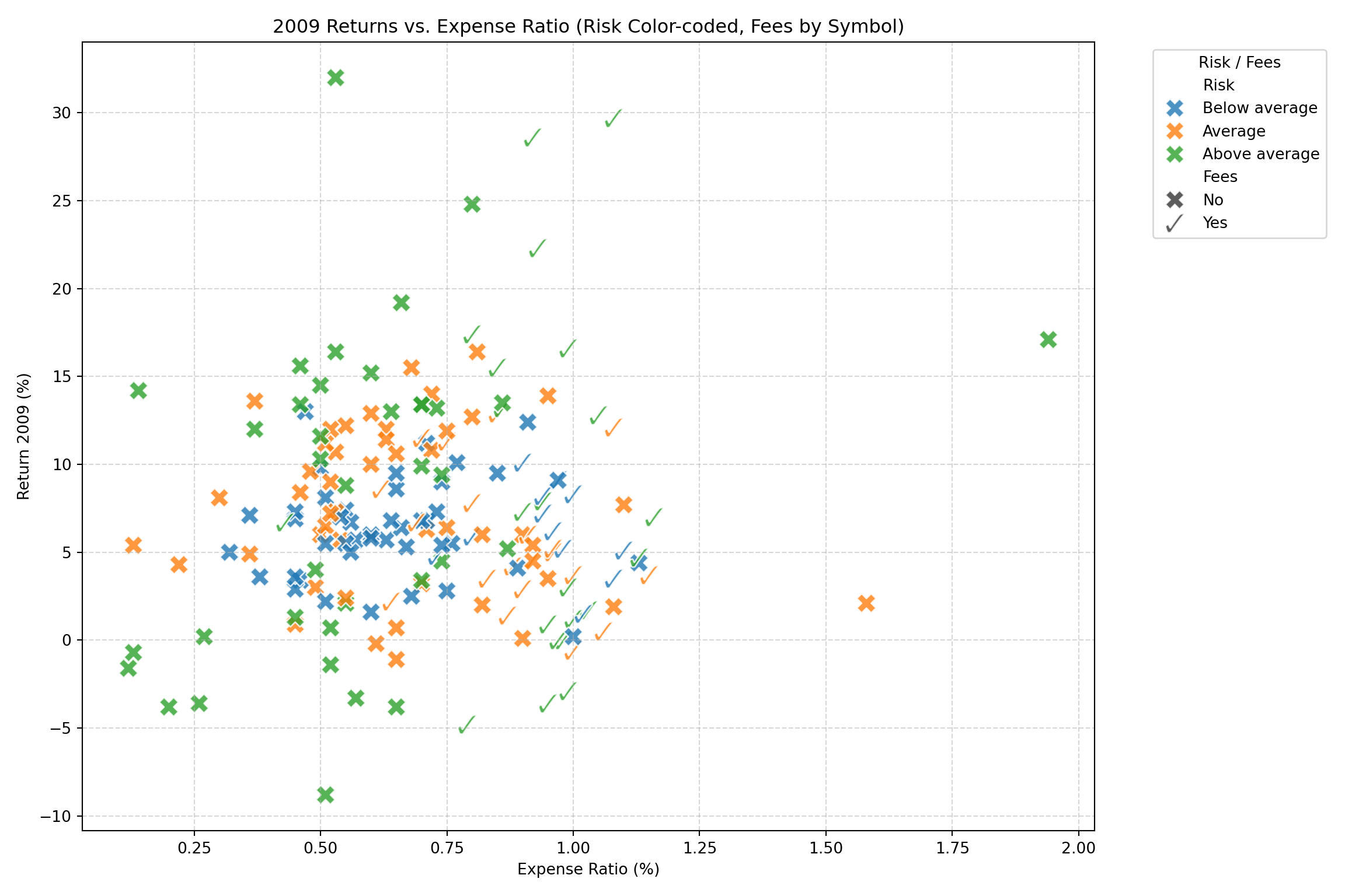
5.2 Returns vs. Expense Ratio (Custom Symbols)
Here we used custom markers to denote Fees (Checkmark vs X) and color for Risk.
How’s that done?
# Define custom markers: Check for 'Yes', X for 'No'markers = {"Yes": r'$\checkmark$', "No": "X"}plt.figure(figsize=(12, 8))sns.scatterplot( data=df, x='Expense Ratio', y='Return 2009', hue='Risk', style='Fees', markers=markers, s=150, alpha=0.8)plt.title('2009 Returns vs. Expense Ratio (Risk Color-coded, Fees by Symbol)')plt.xlabel('Expense Ratio (%)')plt.ylabel('Return 2009 (%)')plt.grid(True, linestyle='--', alpha=0.5)plt.legend(bbox_to_anchor=(1.05, 1), loc='upper left', title="Risk / Fees")plt.tight_layout()plt.show()
5.3 Interactive Plotly Scatterplot
Finally, here is the code to generate an interactive version of the previous plot using Plotly.
This document contains the complete analytical workflow generated during our session, formatted for use in Quarto.
1. Initial Exploration: Asset Distribution
We began by examining the distribution of assets across the funds using a histogram with density overlays.
How’s that done?
import pandas as pdimport matplotlib.pyplot as pltimport numpy as npfrom scipy.stats import gaussian_kde# Load the datasetdf = pd.read_csv('./BondFunds.csv')assets = df['Assets'].dropna()# Define bin parametersbin_size =100bins = np.arange(0, assets.max() + bin_size, bin_size)# Create the plotplt.figure(figsize=(12, 7))# 1. Histogramplt.hist(assets, bins=bins, density=True, color='skyblue', edgecolor='black', alpha=0.5, label='Histogram (Bins=100m)')# Generate points for the KDE linesx_eval = np.linspace(0, assets.max(), 1000)# 2. Density with Default Bandwidthkde_default = gaussian_kde(assets)plt.plot(x_eval, kde_default(x_eval), color='blue', lw=2, label='Density (Default BW)')# 3. Density with Bandwidth = 2kde_bw2 = gaussian_kde(assets, bw_method=2.0)plt.plot(x_eval, kde_bw2(x_eval), color='red', lw=2, linestyle='--', label='Density (BW Factor = 2)')plt.title('Histogram of Assets with Density Overlays')plt.xlabel('Assets (in millions)')plt.ylabel('Density')plt.legend()plt.tight_layout()plt.show()
2. Advanced Distribution Visualization: Boxenplots
To visualize the distribution of assets by fund type, specifically focusing on tail behavior, we used boxenplots.
2.1 Standard Scale
How’s that done?
import seaborn as snsplt.figure(figsize=(10, 6))sns.boxenplot(x='Type', y='Assets', data=df, palette='muted')plt.title('Boxenplot of Assets by Fund Type')plt.xlabel('Fund Type')plt.ylabel('Assets (in millions)')plt.grid(axis='y', linestyle='--', alpha=0.3)plt.tight_layout()plt.show()
2.2 Logarithmic Scale
Recognizing the skew in the data, we reconstructed the boxenplot on a logarithmic scale.
<string>:1: FutureWarning:


Passing `palette` without assigning `hue` is deprecated and will be removed in v0.14.0. Assign the `x` variable to `hue` and set `legend=False` for the same effect.
How’s that done?
ax.set_yscale("log")plt.title('Boxenplot of Assets by Fund Type (Logarithmic Scale)')plt.xlabel('Fund Type')plt.ylabel('Assets (in millions, Log Scale)')plt.grid(axis='y', which='both', linestyle='--', alpha=0.3)plt.tight_layout()plt.show()
3. Performance Analysis: 2009 Returns
We then shifted focus to the returns in 2009.
3.1 Boxenplot of Returns by Type
How’s that done?
plt.figure(figsize=(10, 6))sns.boxenplot(x='Type', y='Return 2009', data=df, palette='muted')plt.title('Boxenplot of 2009 Returns by Fund Type')plt.xlabel('Fund Type')plt.ylabel('Return in 2009 (%)')plt.grid(axis='y', linestyle='--', alpha=0.3)plt.tight_layout()plt.show()
3.2 Violin Plot by Risk and Type
We introduced Risk into the analysis, visualizing returns with split violin plots.
How’s that done?
# Define categorical order for Riskrisk_order = ['Below average', 'Average', 'Above average']# Ensure Risk column is categorical with orderif'Risk'in df.columns: unique_risks = df['Risk'].unique()# Filter risk_order to only include present categories present_risks = [r for r in risk_order if r in unique_risks]# Add any missing risks to the end if necessary, or just use present_risks# This logic handles potential data mismatch df['Risk'] = pd.Categorical(df['Risk'], categories=risk_order, ordered=True)plt.figure(figsize=(12, 7))sns.violinplot(data=df, x='Risk', y='Return 2009', hue='Type', split=True, inner="quart")plt.title('2009 Returns by Risk Level and Fund Type')plt.xlabel('Risk Level')plt.ylabel('Return 2009 (%)')plt.legend(title='Fund Type')plt.grid(axis='y', linestyle='--', alpha=0.3)plt.tight_layout()plt.show()
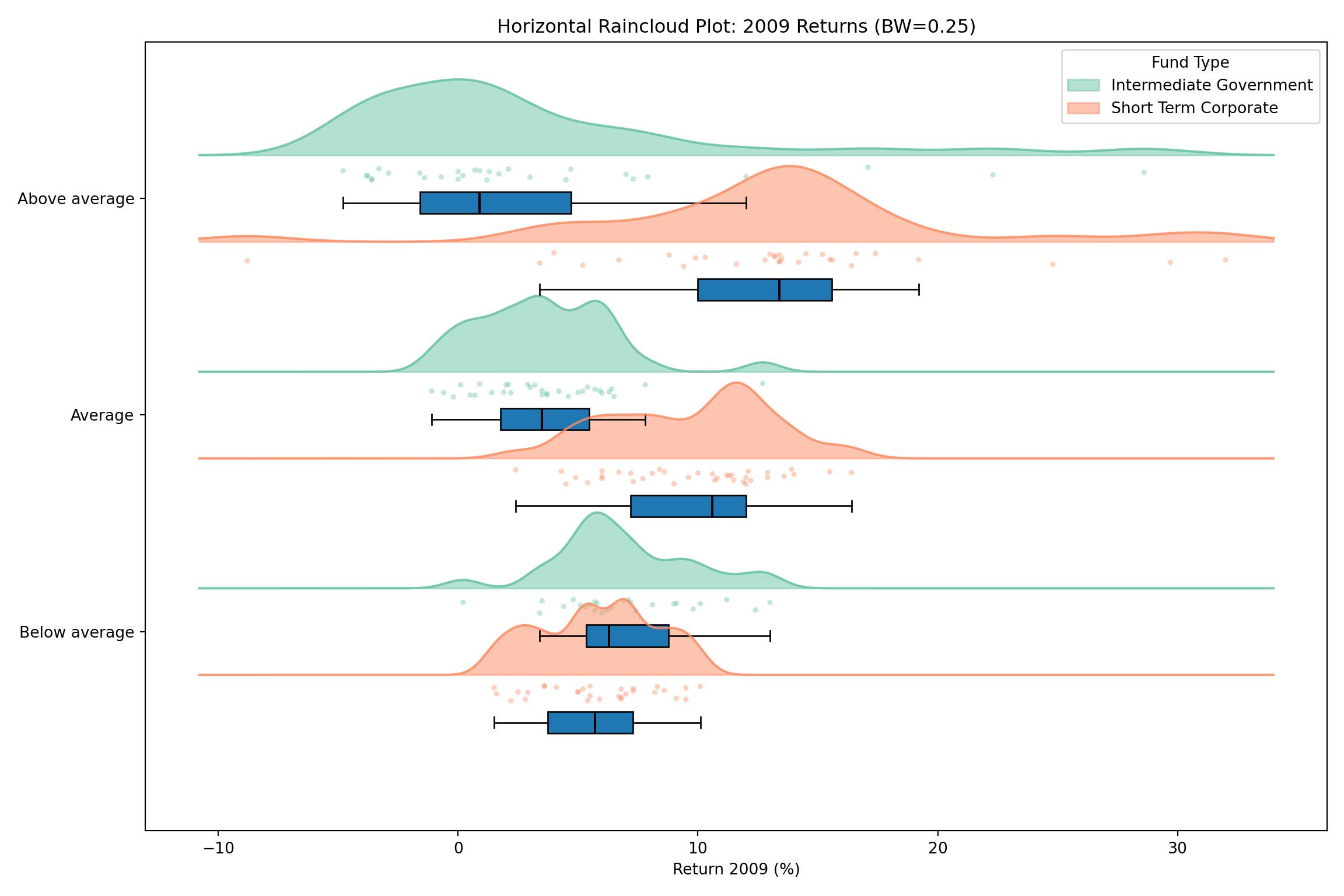
4. Horizontal Raincloud Plots
We refined the visualization into “Raincloud” plots to show density, raw data, and summary statistics simultaneously, oriented horizontally.
<matplotlib.collections.FillBetweenPolyCollection object at 0x12d8af890>
[<matplotlib.lines.Line2D object at 0x12d9192b0>]
<matplotlib.collections.PathCollection object at 0x12d8af9d0>
{'whiskers': [<matplotlib.lines.Line2D object at 0x12d919400>, <matplotlib.lines.Line2D object at 0x12d919550>], 'caps': [<matplotlib.lines.Line2D object at 0x12d9196a0>, <matplotlib.lines.Line2D object at 0x12d9197f0>], 'boxes': [<matplotlib.patches.PathPatch object at 0x12d8afc50>], 'medians': [<matplotlib.lines.Line2D object at 0x12d919940>], 'fliers': [], 'means': []}
<matplotlib.collections.FillBetweenPolyCollection object at 0x12d8afb10>
[<matplotlib.lines.Line2D object at 0x12d919a90>]
<matplotlib.collections.PathCollection object at 0x12d8afed0>
{'whiskers': [<matplotlib.lines.Line2D object at 0x12d919be0>, <matplotlib.lines.Line2D object at 0x12d919d30>], 'caps': [<matplotlib.lines.Line2D object at 0x12d919e80>, <matplotlib.lines.Line2D object at 0x12d919fd0>], 'boxes': [<matplotlib.patches.PathPatch object at 0x12d968190>], 'medians': [<matplotlib.lines.Line2D object at 0x12d91a120>], 'fliers': [], 'means': []}
<matplotlib.collections.FillBetweenPolyCollection object at 0x12d968050>
[<matplotlib.lines.Line2D object at 0x12d91a270>]
<matplotlib.collections.PathCollection object at 0x12d9682d0>
{'whiskers': [<matplotlib.lines.Line2D object at 0x12d91a3c0>, <matplotlib.lines.Line2D object at 0x12d91a510>], 'caps': [<matplotlib.lines.Line2D object at 0x12d91a660>, <matplotlib.lines.Line2D object at 0x12d91a7b0>], 'boxes': [<matplotlib.patches.PathPatch object at 0x12d968550>], 'medians': [<matplotlib.lines.Line2D object at 0x12d91a900>], 'fliers': [], 'means': []}
<matplotlib.collections.FillBetweenPolyCollection object at 0x12d968410>
[<matplotlib.lines.Line2D object at 0x12d91aa50>]
<matplotlib.collections.PathCollection object at 0x12d968690>
{'whiskers': [<matplotlib.lines.Line2D object at 0x12d91aba0>, <matplotlib.lines.Line2D object at 0x12d91acf0>], 'caps': [<matplotlib.lines.Line2D object at 0x12d91ae40>, <matplotlib.lines.Line2D object at 0x12d91af90>], 'boxes': [<matplotlib.patches.PathPatch object at 0x12d968910>], 'medians': [<matplotlib.lines.Line2D object at 0x12d91b0e0>], 'fliers': [], 'means': []}
<matplotlib.collections.FillBetweenPolyCollection object at 0x12d9687d0>
[<matplotlib.lines.Line2D object at 0x12d91b230>]
<matplotlib.collections.PathCollection object at 0x12d968b90>
{'whiskers': [<matplotlib.lines.Line2D object at 0x12d91b380>, <matplotlib.lines.Line2D object at 0x12d91b4d0>], 'caps': [<matplotlib.lines.Line2D object at 0x12d91b620>, <matplotlib.lines.Line2D object at 0x12d91b770>], 'boxes': [<matplotlib.patches.PathPatch object at 0x12d968e10>], 'medians': [<matplotlib.lines.Line2D object at 0x12d91b8c0>], 'fliers': [], 'means': []}
<matplotlib.collections.FillBetweenPolyCollection object at 0x12d968cd0>
[<matplotlib.lines.Line2D object at 0x12d91ba10>]
<matplotlib.collections.PathCollection object at 0x12d968a50>
{'whiskers': [<matplotlib.lines.Line2D object at 0x12d91bb60>, <matplotlib.lines.Line2D object at 0x12d91bcb0>], 'caps': [<matplotlib.lines.Line2D object at 0x12d91be00>, <matplotlib.lines.Line2D object at 0x12d9d8050>], 'boxes': [<matplotlib.patches.PathPatch object at 0x12d969090>], 'medians': [<matplotlib.lines.Line2D object at 0x12d9d81a0>], 'fliers': [], 'means': []}
How’s that done?
ax.set_yticks([i - (type_offset/2) for i inrange(len(risk_order))])ax.set_yticklabels(risk_order)ax.set_xlabel('Return 2009 (%)')ax.set_title('Horizontal Raincloud Plot: 2009 Returns (BW=0.5)')ax.legend(title="Fund Type", loc='upper right')plt.tight_layout()plt.show()
<matplotlib.collections.FillBetweenPolyCollection object at 0x12da2a850>
[<matplotlib.lines.Line2D object at 0x12d9db380>]
<matplotlib.collections.PathCollection object at 0x12da2a5d0>
{'whiskers': [<matplotlib.lines.Line2D object at 0x12d9db4d0>, <matplotlib.lines.Line2D object at 0x12d9db620>], 'caps': [<matplotlib.lines.Line2D object at 0x12d9db770>, <matplotlib.lines.Line2D object at 0x12d9db8c0>], 'boxes': [<matplotlib.patches.PathPatch object at 0x12da2aad0>], 'medians': [<matplotlib.lines.Line2D object at 0x12d9dba10>], 'fliers': [], 'means': []}
<matplotlib.collections.FillBetweenPolyCollection object at 0x12da2a990>
[<matplotlib.lines.Line2D object at 0x12d9dbb60>]
<matplotlib.collections.PathCollection object at 0x12da2ac10>
{'whiskers': [<matplotlib.lines.Line2D object at 0x12d9dbcb0>, <matplotlib.lines.Line2D object at 0x12d9dbe00>], 'caps': [<matplotlib.lines.Line2D object at 0x12dac0050>, <matplotlib.lines.Line2D object at 0x12dac01a0>], 'boxes': [<matplotlib.patches.PathPatch object at 0x12da2ae90>], 'medians': [<matplotlib.lines.Line2D object at 0x12dac02f0>], 'fliers': [], 'means': []}
<matplotlib.collections.FillBetweenPolyCollection object at 0x12da2ad50>
[<matplotlib.lines.Line2D object at 0x12dac0440>]
<matplotlib.collections.PathCollection object at 0x12da2afd0>
{'whiskers': [<matplotlib.lines.Line2D object at 0x12dac0590>, <matplotlib.lines.Line2D object at 0x12dac06e0>], 'caps': [<matplotlib.lines.Line2D object at 0x12dac0830>, <matplotlib.lines.Line2D object at 0x12dac0980>], 'boxes': [<matplotlib.patches.PathPatch object at 0x12da2b250>], 'medians': [<matplotlib.lines.Line2D object at 0x12dac0ad0>], 'fliers': [], 'means': []}
<matplotlib.collections.FillBetweenPolyCollection object at 0x12da2b110>
[<matplotlib.lines.Line2D object at 0x12dac0c20>]
<matplotlib.collections.PathCollection object at 0x12da2b390>
{'whiskers': [<matplotlib.lines.Line2D object at 0x12dac0d70>, <matplotlib.lines.Line2D object at 0x12dac0ec0>], 'caps': [<matplotlib.lines.Line2D object at 0x12dac1010>, <matplotlib.lines.Line2D object at 0x12dac1160>], 'boxes': [<matplotlib.patches.PathPatch object at 0x12da2b610>], 'medians': [<matplotlib.lines.Line2D object at 0x12dac12b0>], 'fliers': [], 'means': []}
<matplotlib.collections.FillBetweenPolyCollection object at 0x12da2b4d0>
[<matplotlib.lines.Line2D object at 0x12dac1400>]
<matplotlib.collections.PathCollection object at 0x12da2b890>
{'whiskers': [<matplotlib.lines.Line2D object at 0x12dac1550>, <matplotlib.lines.Line2D object at 0x12dac16a0>], 'caps': [<matplotlib.lines.Line2D object at 0x12dac17f0>, <matplotlib.lines.Line2D object at 0x12dac1940>], 'boxes': [<matplotlib.patches.PathPatch object at 0x12da2bb10>], 'medians': [<matplotlib.lines.Line2D object at 0x12dac1a90>], 'fliers': [], 'means': []}
<matplotlib.collections.FillBetweenPolyCollection object at 0x12da2b9d0>
[<matplotlib.lines.Line2D object at 0x12dac1be0>]
<matplotlib.collections.PathCollection object at 0x12da2b750>
{'whiskers': [<matplotlib.lines.Line2D object at 0x12dac1d30>, <matplotlib.lines.Line2D object at 0x12dac1e80>], 'caps': [<matplotlib.lines.Line2D object at 0x12dac1fd0>, <matplotlib.lines.Line2D object at 0x12dac2120>], 'boxes': [<matplotlib.patches.PathPatch object at 0x12da2bd90>], 'medians': [<matplotlib.lines.Line2D object at 0x12dac2270>], 'fliers': [], 'means': []}
How’s that done?
ax.set_yticks([i - (type_offset/2) for i inrange(len(risk_order))])ax.set_yticklabels(risk_order)ax.set_xlabel('Return 2009 (%)')ax.set_title('Horizontal Raincloud Plot: 2009 Returns (BW=0.25)')ax.legend(title="Fund Type", loc='upper right')plt.tight_layout()plt.show()
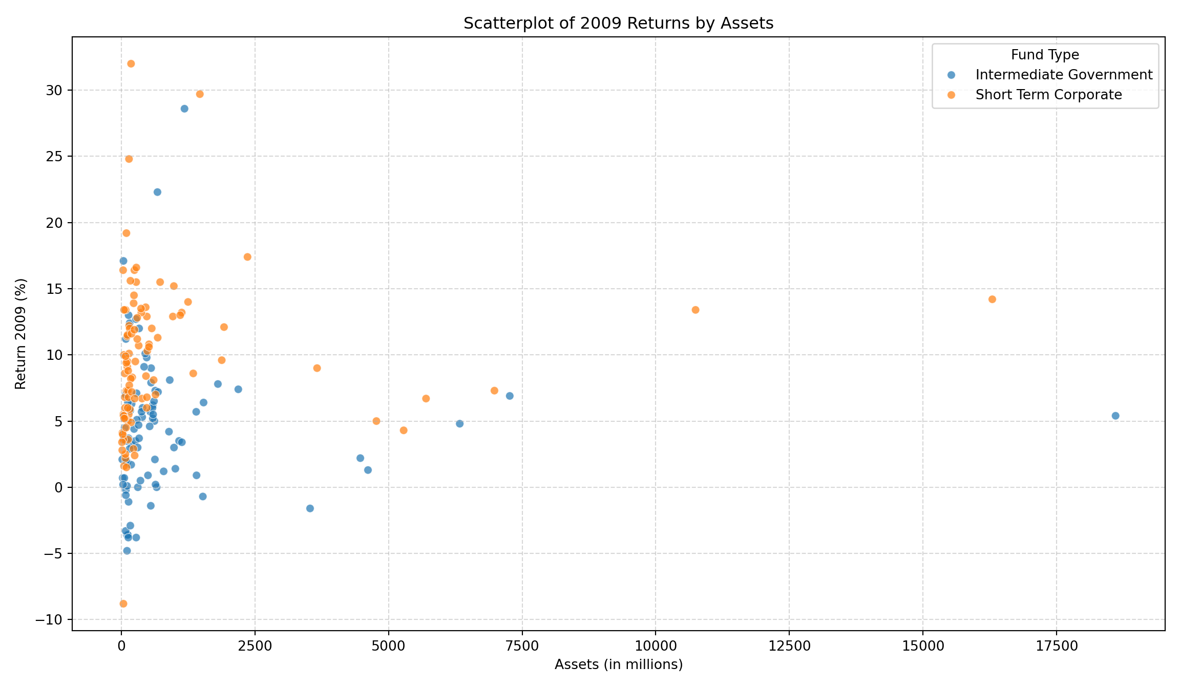
5. Scatterplot Analysis
We concluded by looking at relationships between variables.
5.1 Returns vs. Assets
How’s that done?
plt.figure(figsize=(12, 7))sns.scatterplot(data=df, x='Assets', y='Return 2009', hue='Type', alpha=0.7)plt.title('Scatterplot of 2009 Returns by Assets')plt.xlabel('Assets (in millions)')plt.ylabel('Return 2009 (%)')plt.grid(True, linestyle='--', alpha=0.5)plt.legend(title='Fund Type')plt.tight_layout()plt.show()
5.2 Returns vs. Expense Ratio (Custom Symbols)
Here we used custom markers to denote Fees (Checkmark vs X) and color for Risk.
How’s that done?
# Define custom markers: Check for 'Yes', X for 'No'markers = {"Yes": r'$\checkmark$', "No": "X"}plt.figure(figsize=(12, 8))sns.scatterplot( data=df, x='Expense Ratio', y='Return 2009', hue='Risk', style='Fees', markers=markers, s=150, alpha=0.8)plt.title('2009 Returns vs. Expense Ratio (Risk Color-coded, Fees by Symbol)')plt.xlabel('Expense Ratio (%)')plt.ylabel('Return 2009 (%)')plt.grid(True, linestyle='--', alpha=0.5)plt.legend(bbox_to_anchor=(1.05, 1), loc='upper left', title="Risk / Fees")plt.tight_layout()plt.show()
5.3 Interactive Plotly Scatterplot
Finally, here is the code to generate an interactive version of the previous plot using Plotly.